


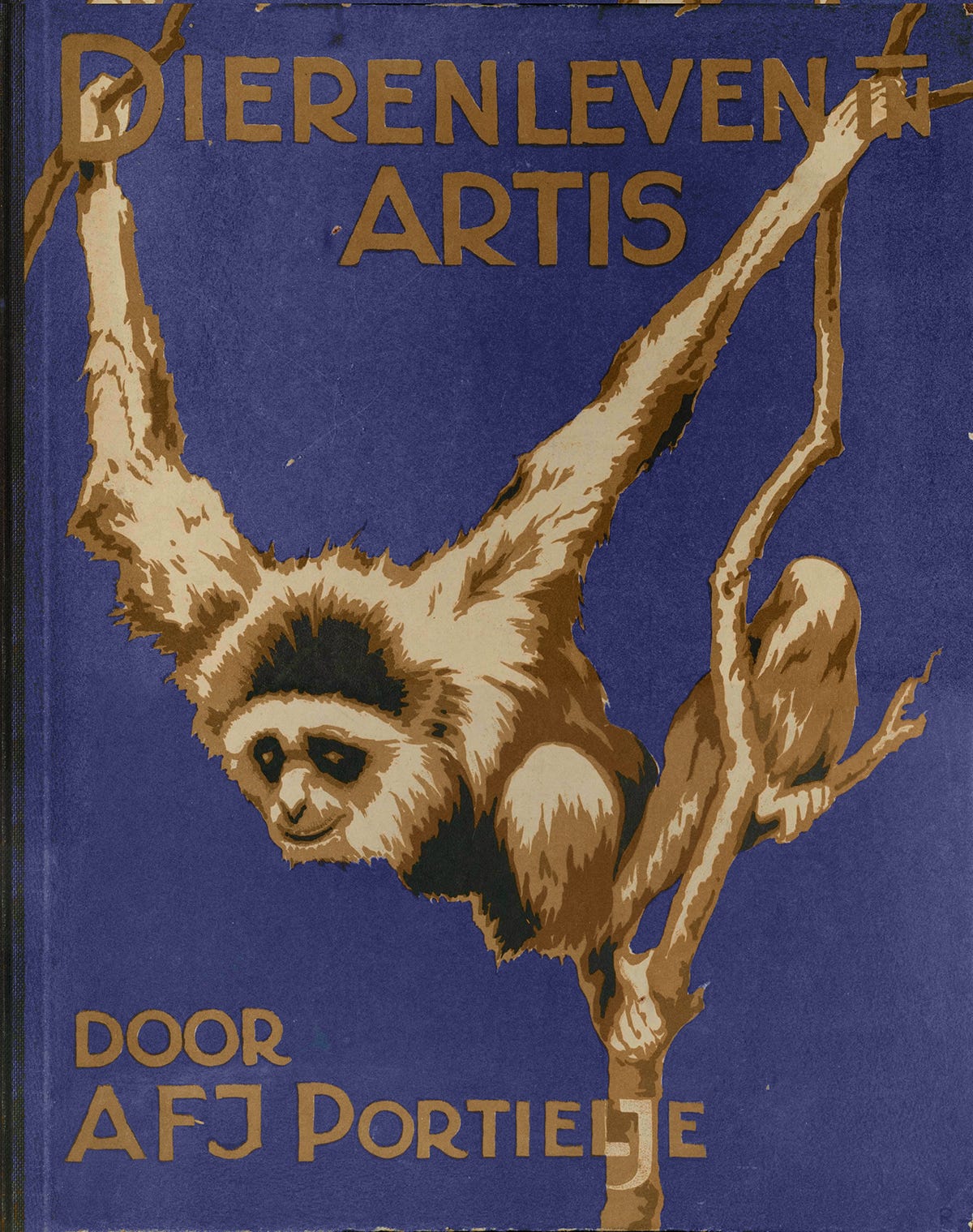
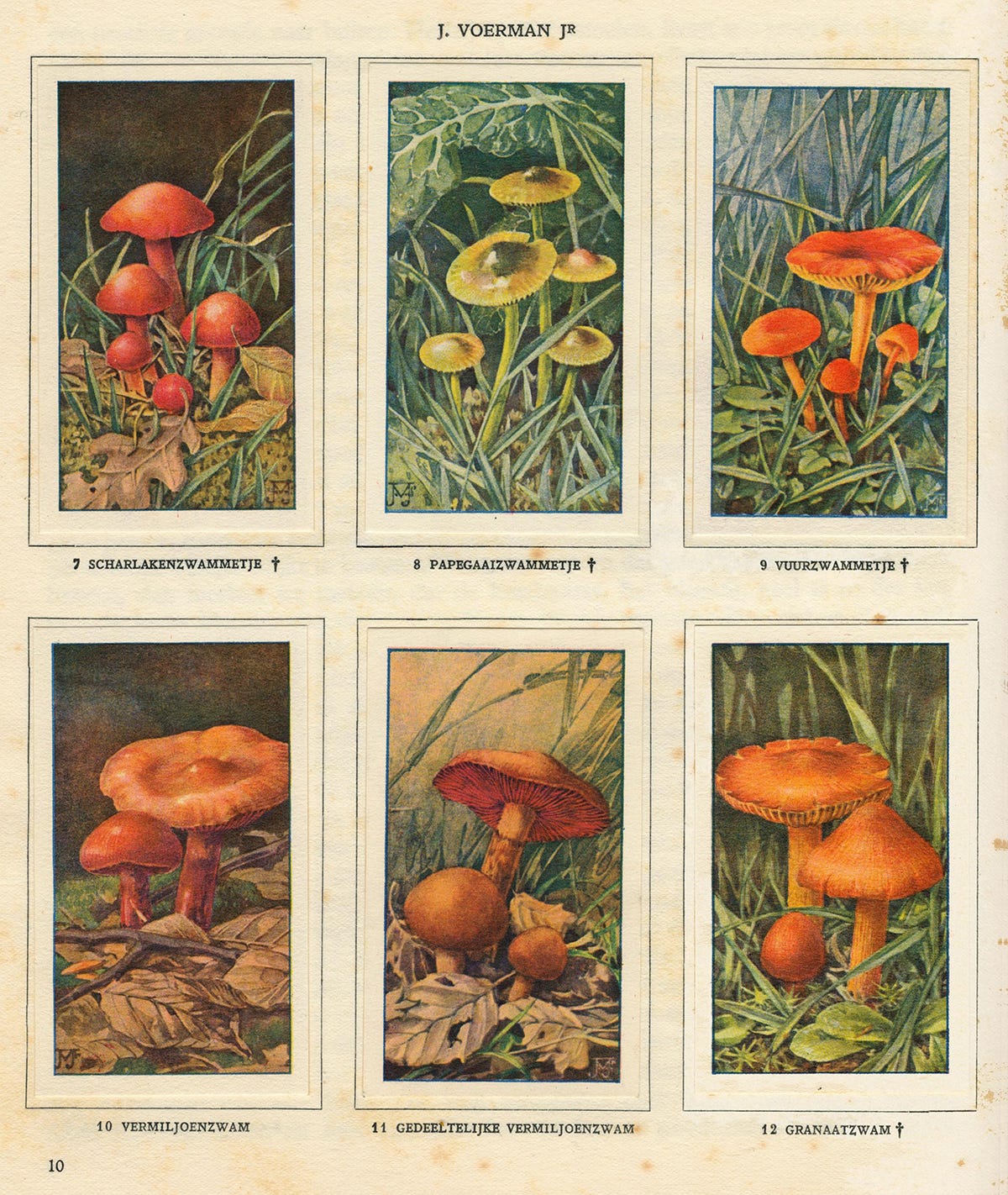
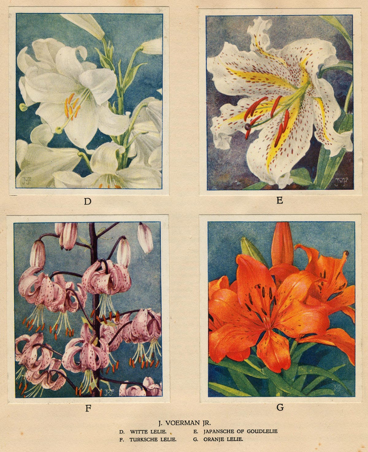
Verkade Plaatjes
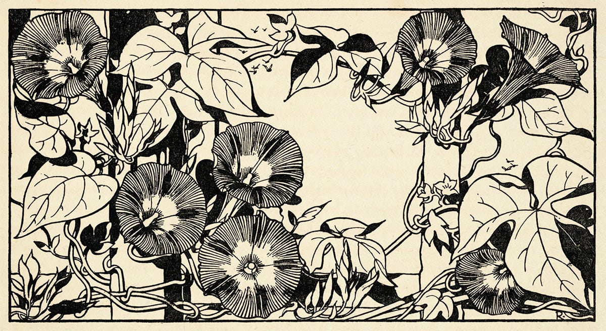
Today's collection is a series of books and illustrations created by Dutch cake & biscuit manufacturer Verkade. The genre started in 1903 when Verkade began including illustrated cards within their product packaging (similar to cigarette cards or a chic crackerjack toy) that could be collected and glued into specially made albums or "plaatjes." The first three books produced were all fairytale themed, but over the next forty years, over 30 million individual cards and 3.2 million copies of topical albums were manufactured across at least 30 different themes—from flora and fauna to landscapes, churches, farms and castles. The cards themselves were usually full-color, illustrated in watercolor or gouache by the who's-who Dutch illustrators of the time like Jan Voerman Jr. and Willem Wenckebach, while in-book illustrations were typically detailed black and white etchings. I'm particularly keen on the typography of the covers and title pages, which are surprisingly minimal while still containing just enough Art Deco idiosyncrasies to surprise.


In the time I spent not writing *this* newsletter, I did write two pieces for AIGA Eye on Design about the rise of ’80s ad aesthetics (and what it means about our collective pandemic ennui) and the downsides of moodboarding.
Elsewhere on the internet, I was interviewed by The Brand Identity about collaboration, freelancing and design history.

This issue's featured archive is Самое Bажное (The Most Important), a blog that collects scans of board games, toys, comics, and books for children from the USSR. There's something so distinctive about the illustration style of 1960-80s Soviet commercial art that I always have a hard time putting into words but love dearly—I think it's some combination of minimalist naivety, maximalist shading, and subtle tactile textures. As always, my favorite archives remain disorganized blogspots from the early 2000s
