Sweet and Sour
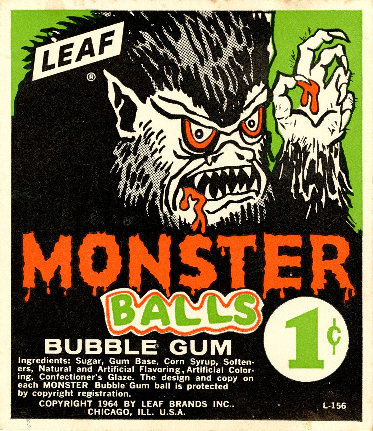
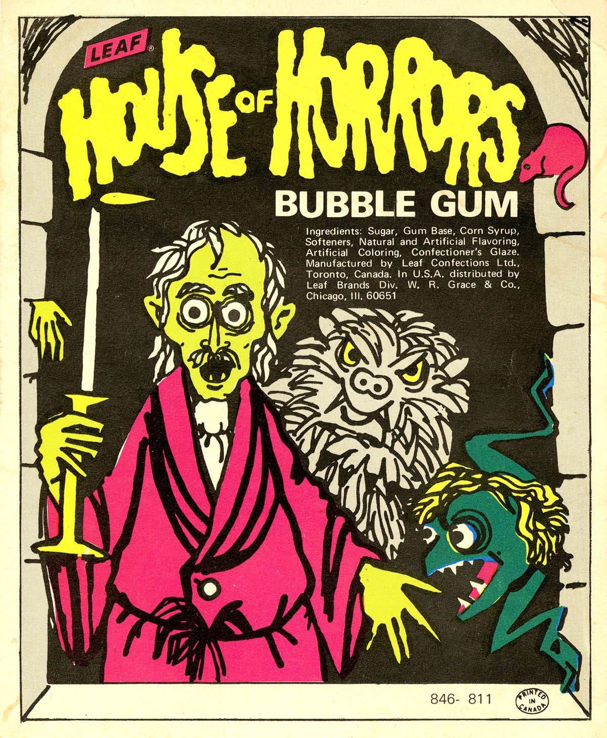
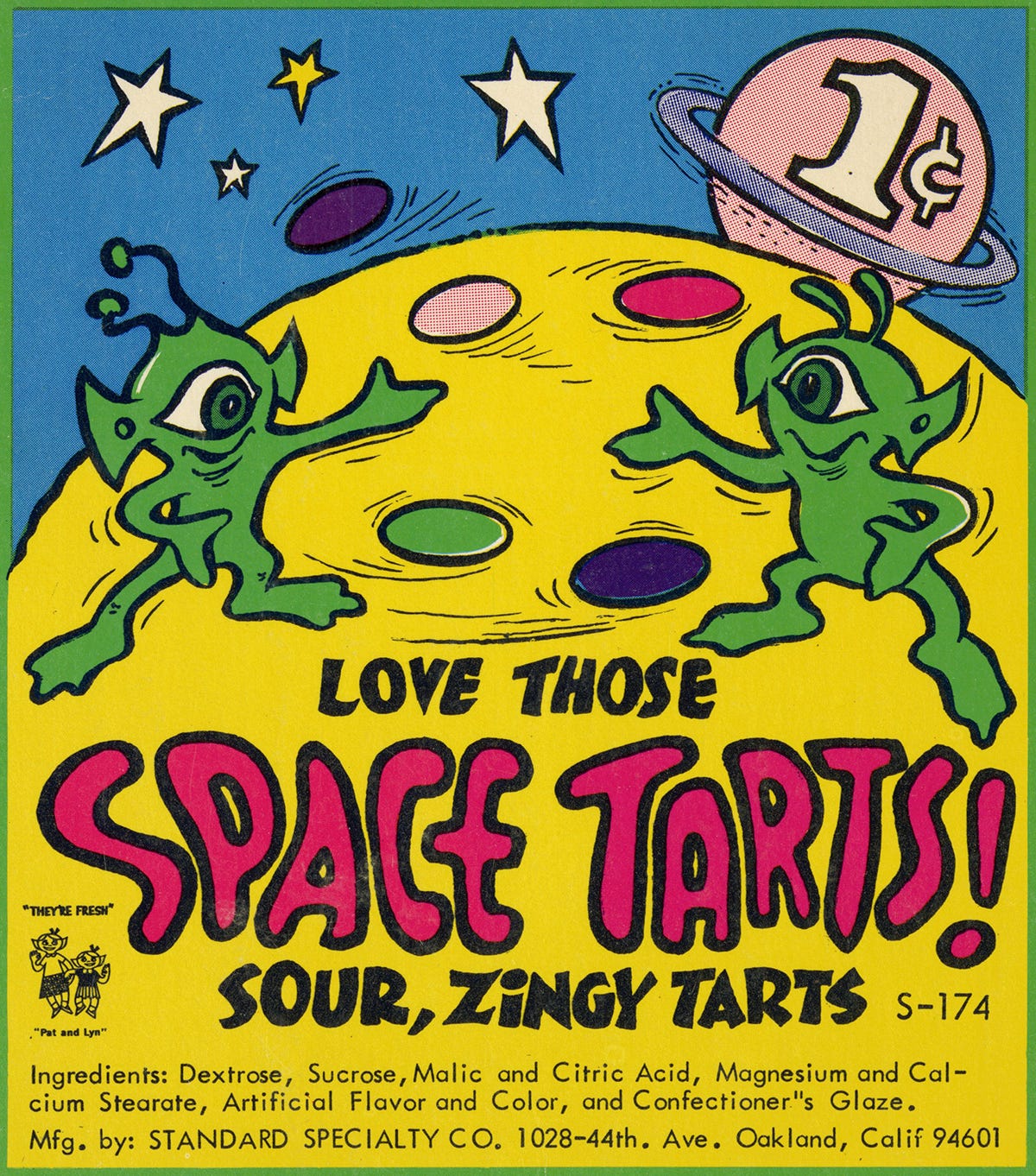
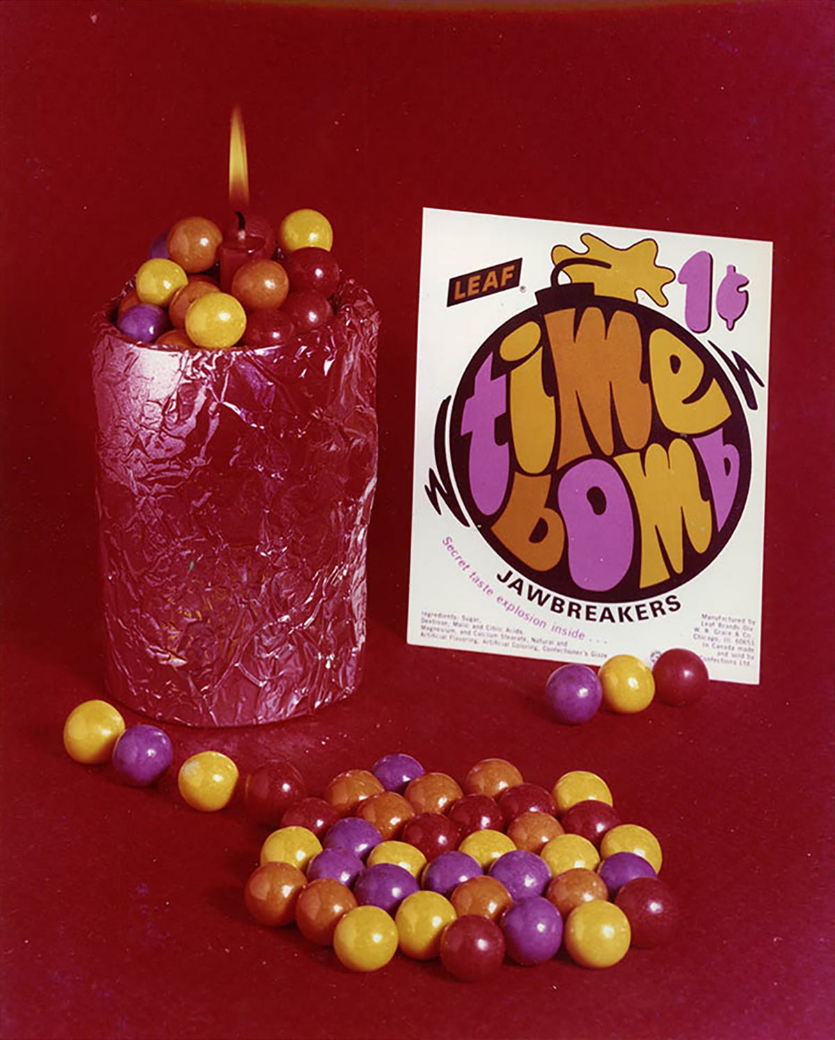
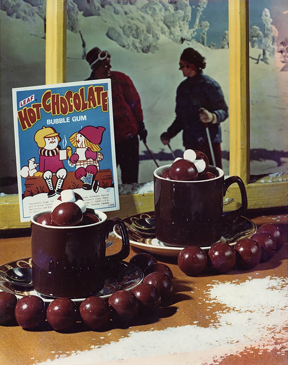
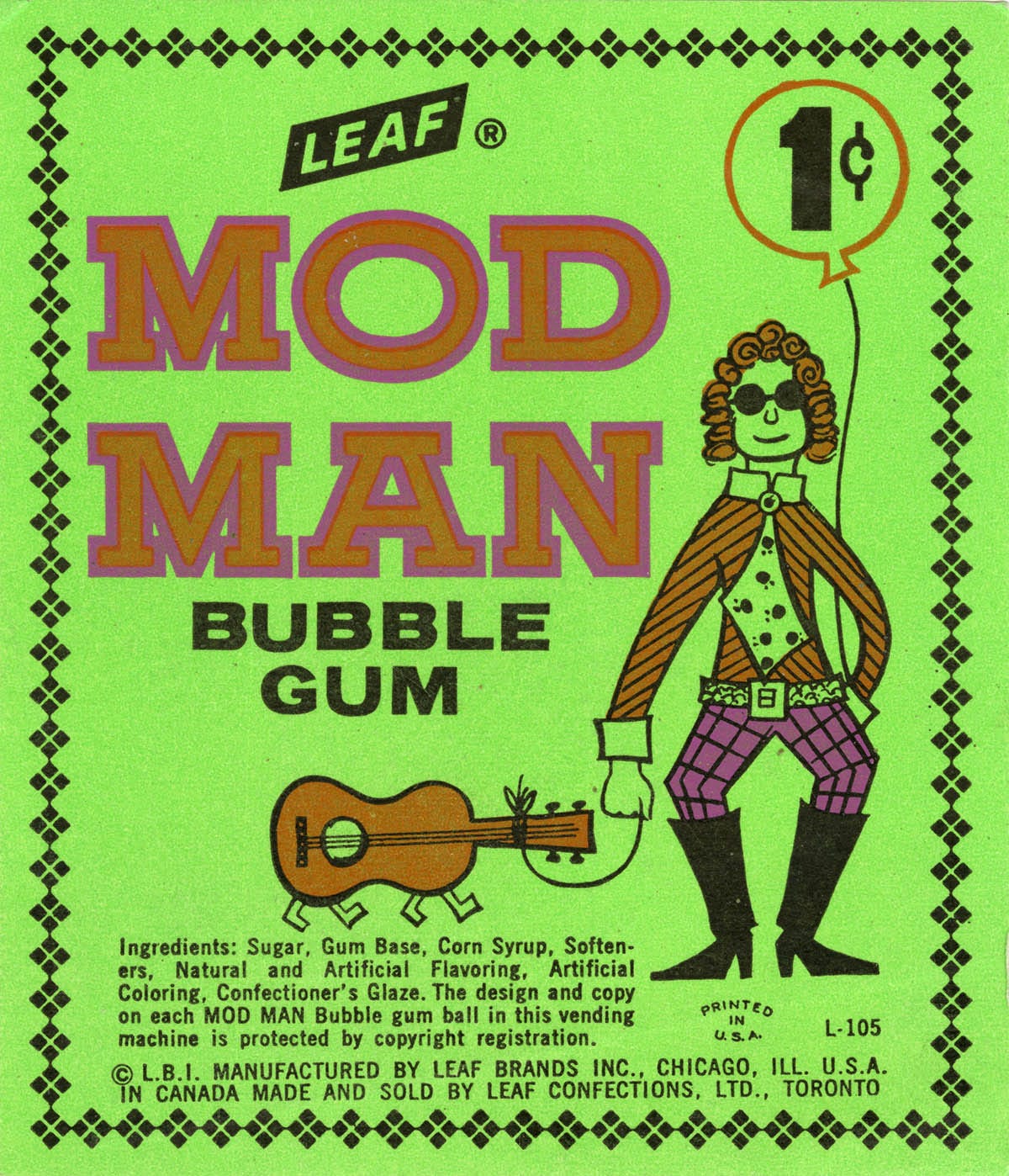
Today's collection is a series of advertising cards by Leaf International, a Chicago confectionery company founded in the 1940s. These small, cheaply printed paper placards would slip into a window of a gumball machine to advertise a given product, meaning they had to appeal to both the distributor and store owners picking what candies to stock (advertised to them via vendor catalogs, photos of which are interspersed in this post) and to the children dispensing the coins. Most of the candies Leaf produced were fairly generic—half inch balls or disks with only slight variations in color or taste—so the company constantly rebranded and renamed them to appeal to different target audiences, trending tastes, and seasonal events. Notable examples are the halloween candies, as well as the "no-cola" bubble-gum, a clear homage to Seven Up's 1970s "Un-Cola" campaign that featured art by John Alcorn, Milton Glaser, and other heavy hitters of the era.
I've actually been thinking a lot about candy recently, as I just read a book called Candy Freak about the history of candy manufacturing in America. The long and short of it is that, like so many other industries, the American confectionary scene has been profoundly impacted by monopolization, with thousands of regional candy makers slowly gobbled up by a handful of large international conglomerates (mostly Mars, Hershey, and Nestle here in the USA.) A side effect of this corporate flattening is an aesthetic homogenization as well; new candies, and their associated packaging, is now researched and developed over the course of years rather than days or months, and weird for the sake of weird isn't worth the cost of entry. But what does a culture lose when almost all of the printed material that makes up our daily visual landscape has to adhere to a strict set of marketing guidelines?
This issue's featured archive is the Outdoor Recreation Archive at Utah State University, a digital and IRL archive of materials related to outdoor gear and outdoor recreation. With gorpcore still in full swing, it's a real treat to see primary sources that show the aesthetic origins of outdoorsmanship. It's also interesting to see how the visual motifs of outdoor recreation aligns, and departs, from other related topics like competitive sports and naturalism. My personal favorite pieces in the collection are the Summit catalogs, which are especially well art directed.
If you're looking for some more in-depth commentary on miscellaneous design topics, I wrote the release post for Frere-Jones Type's amazing new family Community Gothic—a typeface which I think ephemera lovers will especially love. I also wrote a handful of articles for Shaping Design this fall about the rise of big footers, squishy typography, and 2023 web trends.


