I'm so excited to be publishing our first ever newsletter by a guest contributor today! This issue was written and researched by San Francisco based designer + art director Darian Newman, who currently works as a Visual Designer at Dropbox and an instructor at California College of the Arts. Please enjoy—and please shoot me a message if you have a collection you'd like to share in this space.
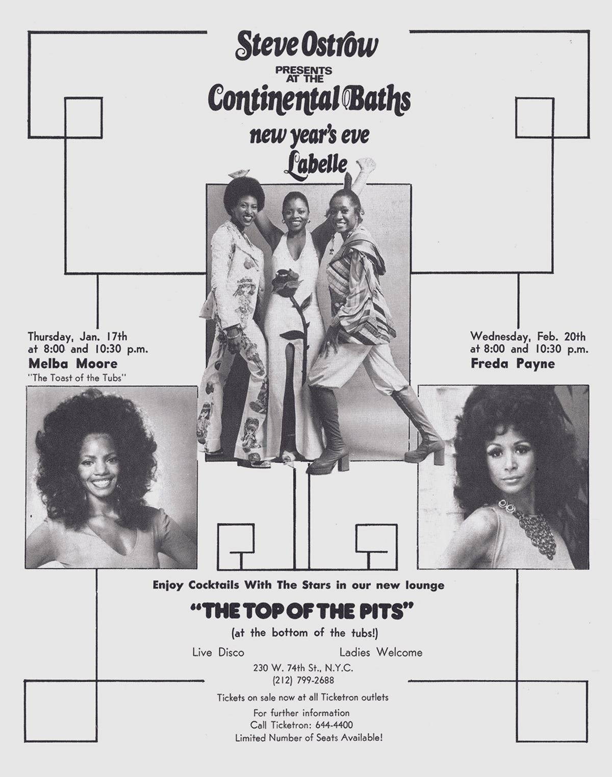
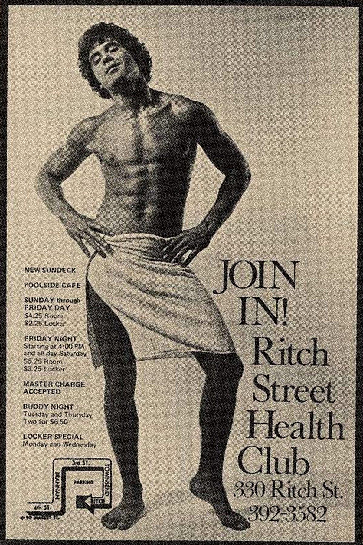
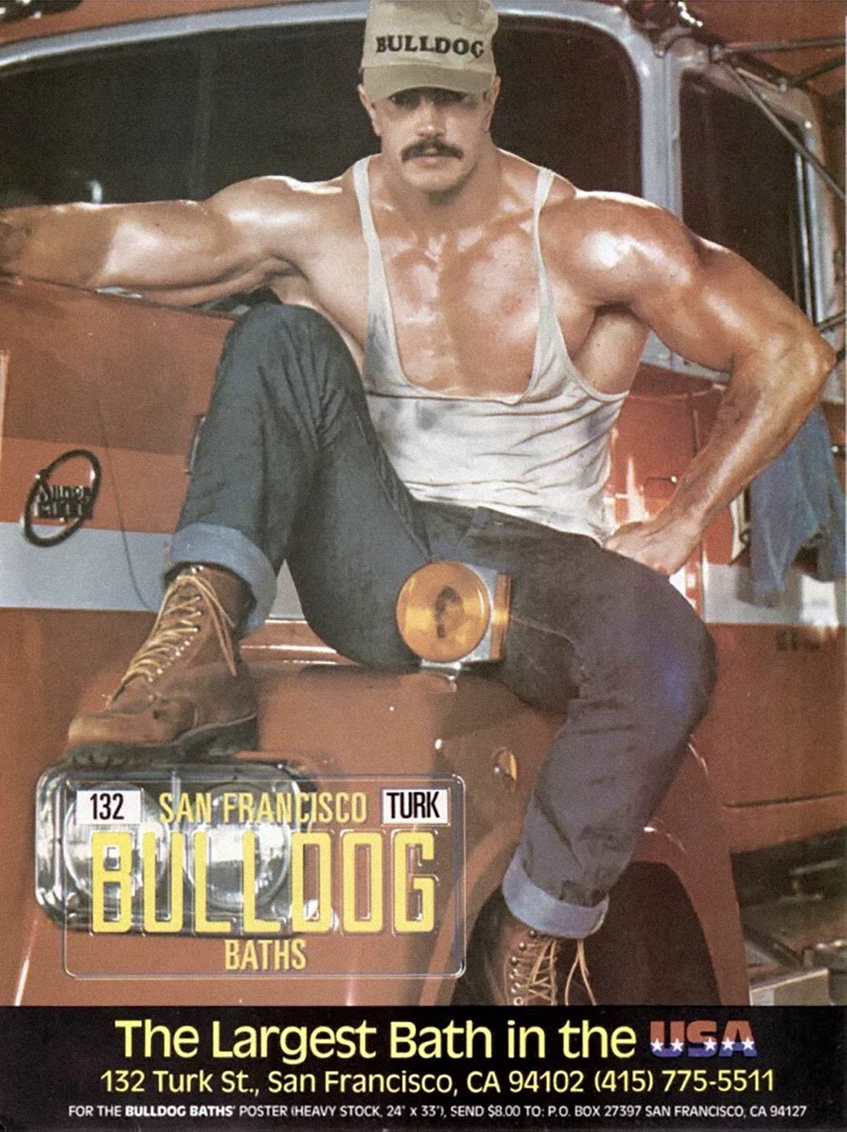
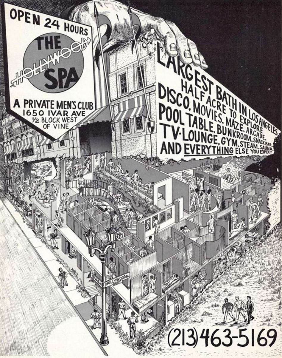
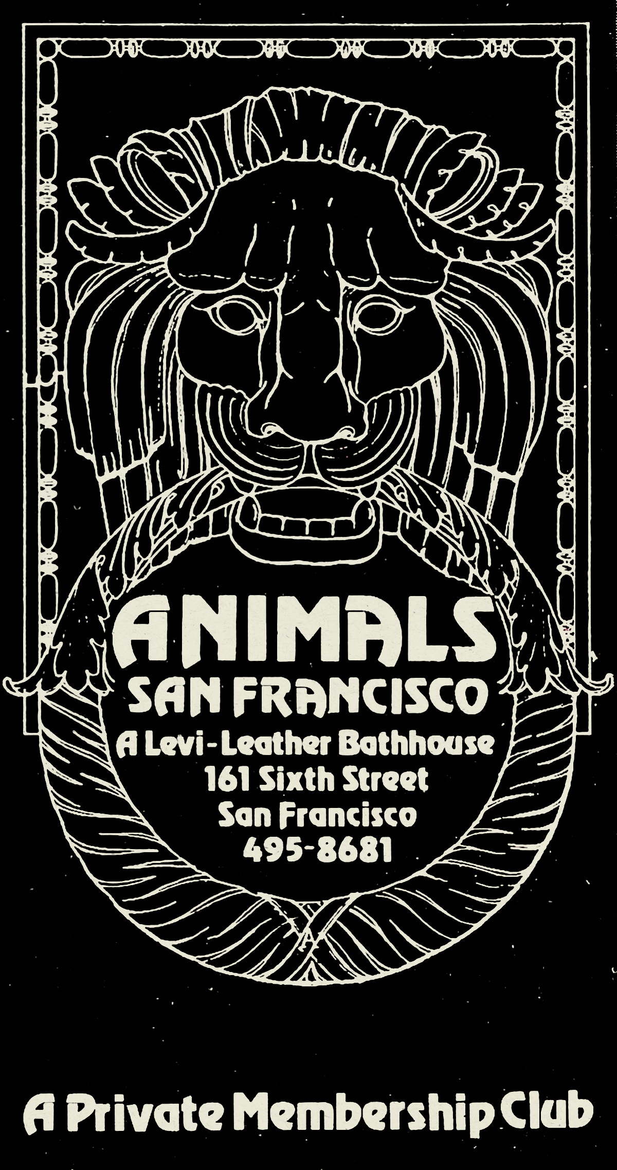
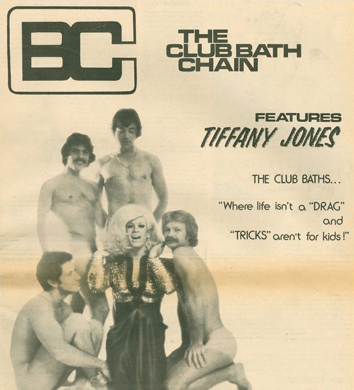
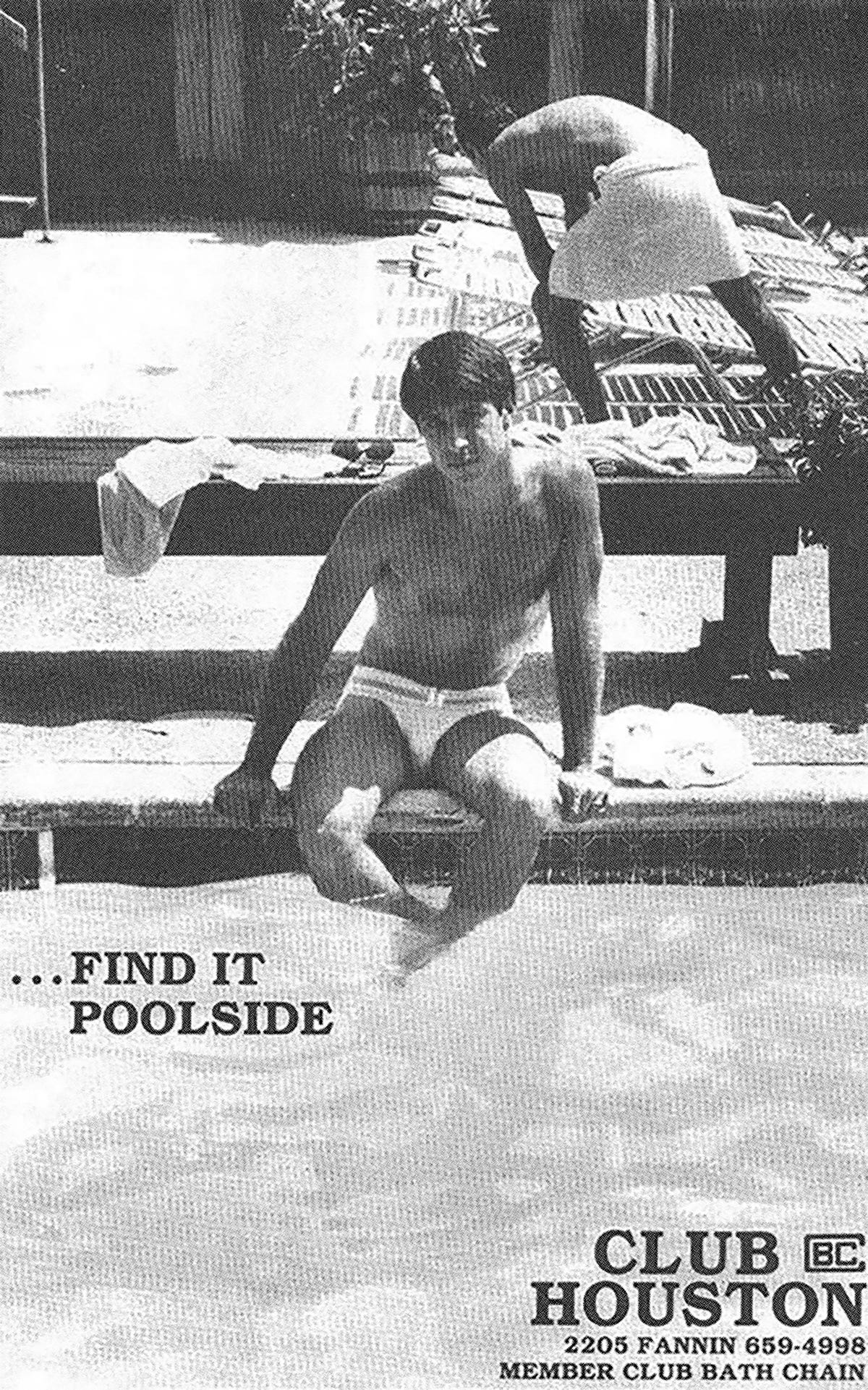
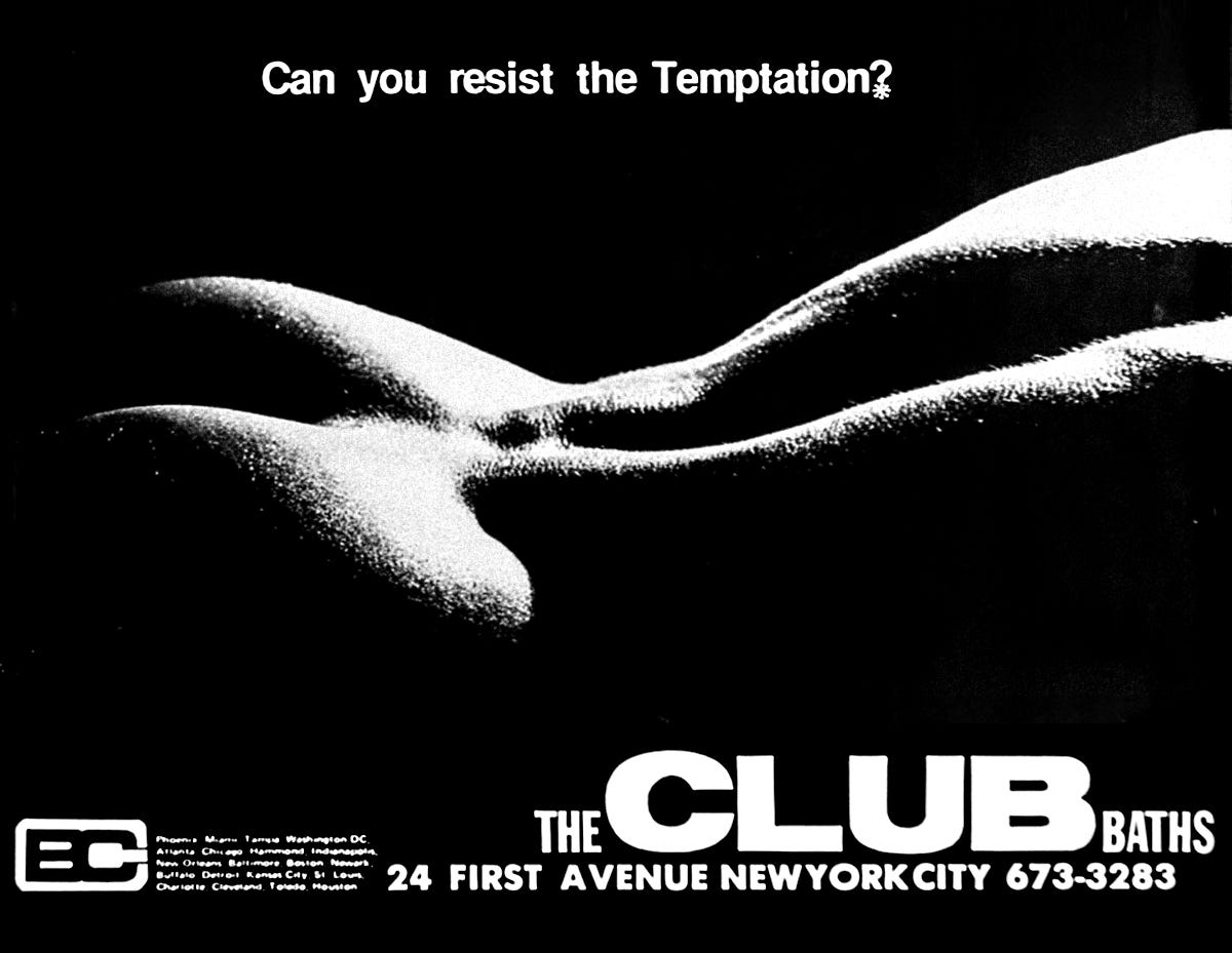
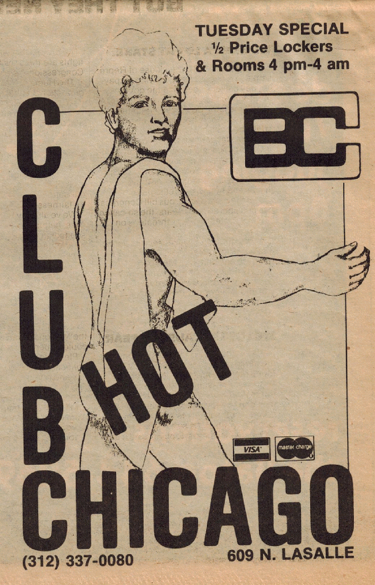
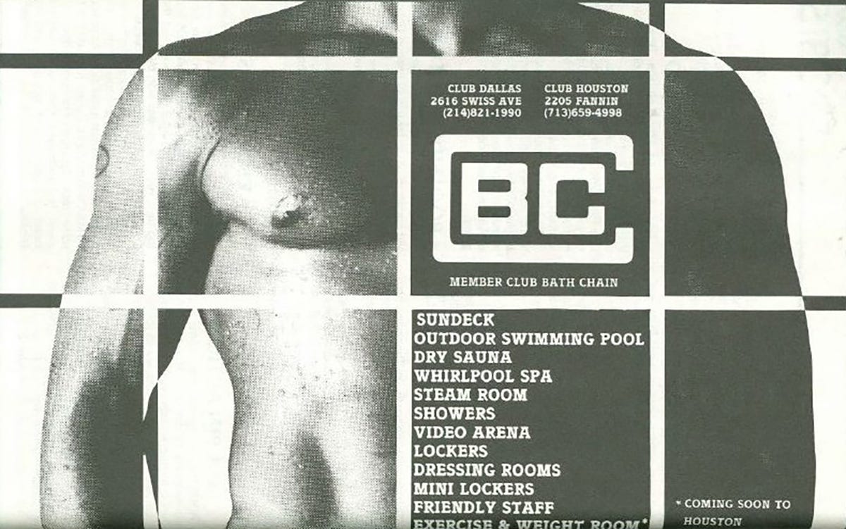
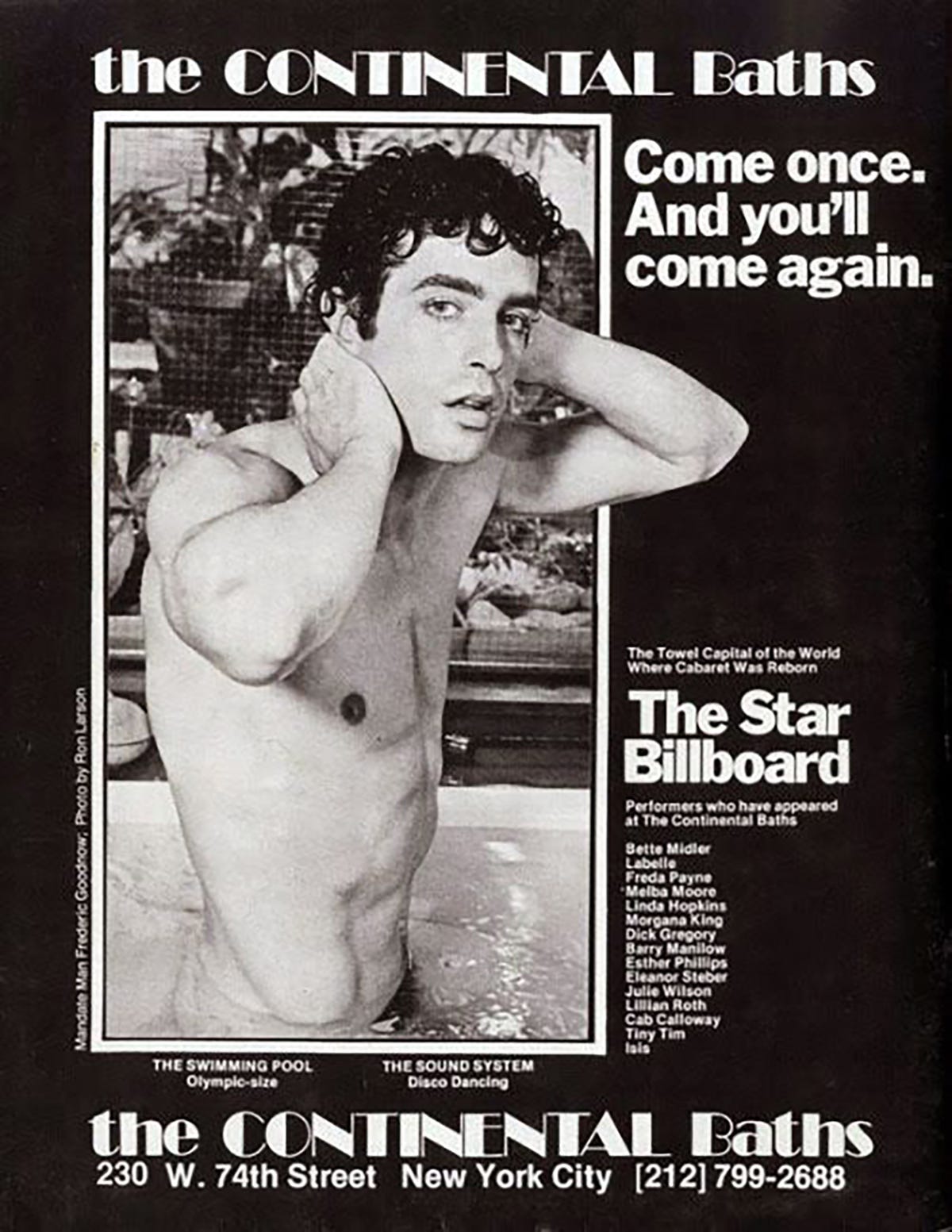
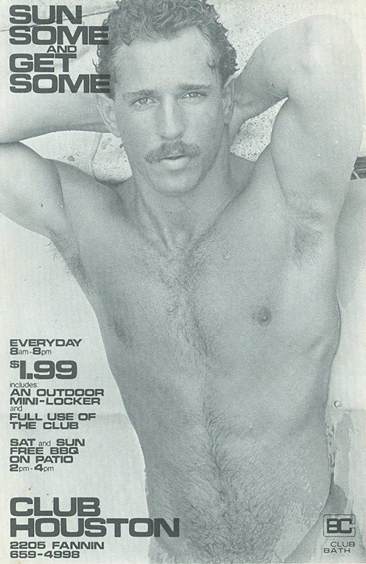
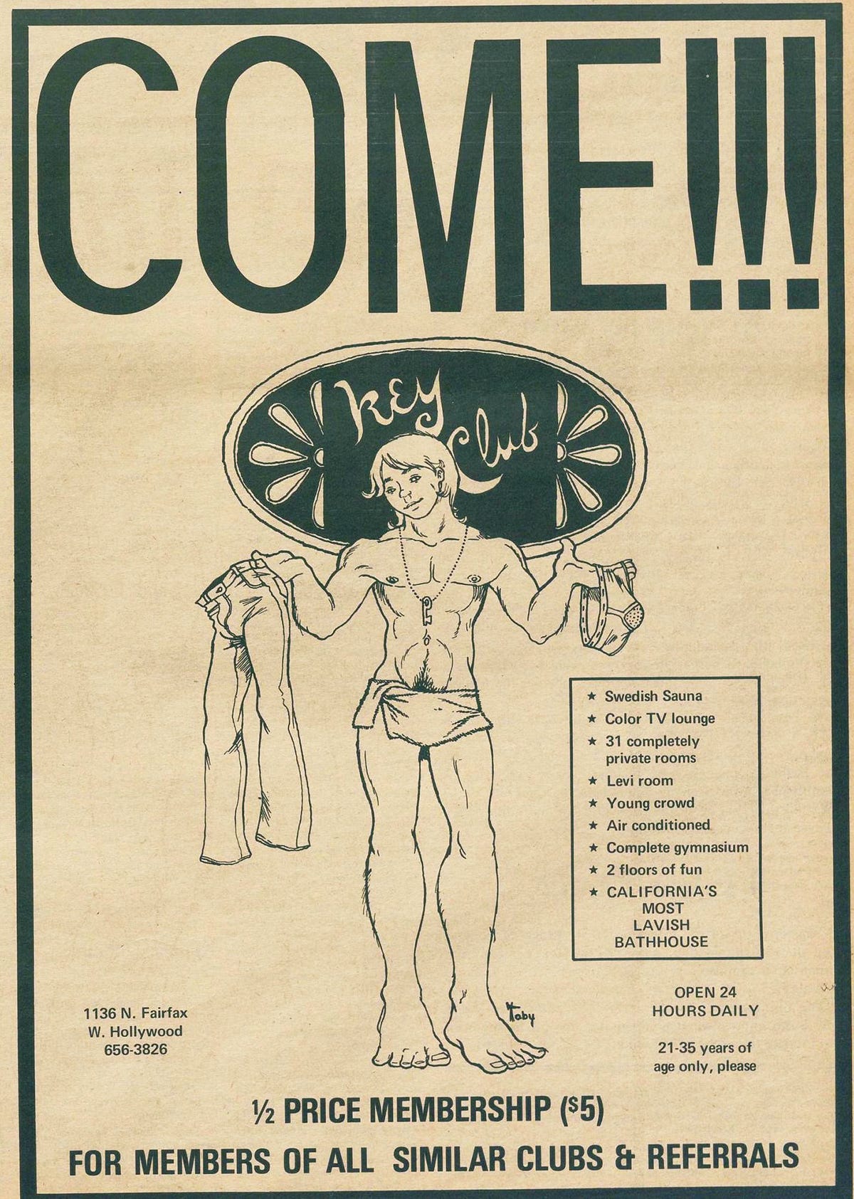
When we look at design history through the lens of any marginalized community we tend to think of protest—but what does the design of gay pleasure look like? Today’s collection is a series of posters designed as advertisements for gay bathhouses c.1960-1970, before the AIDS epidemic forced many of the bathhouses to close.
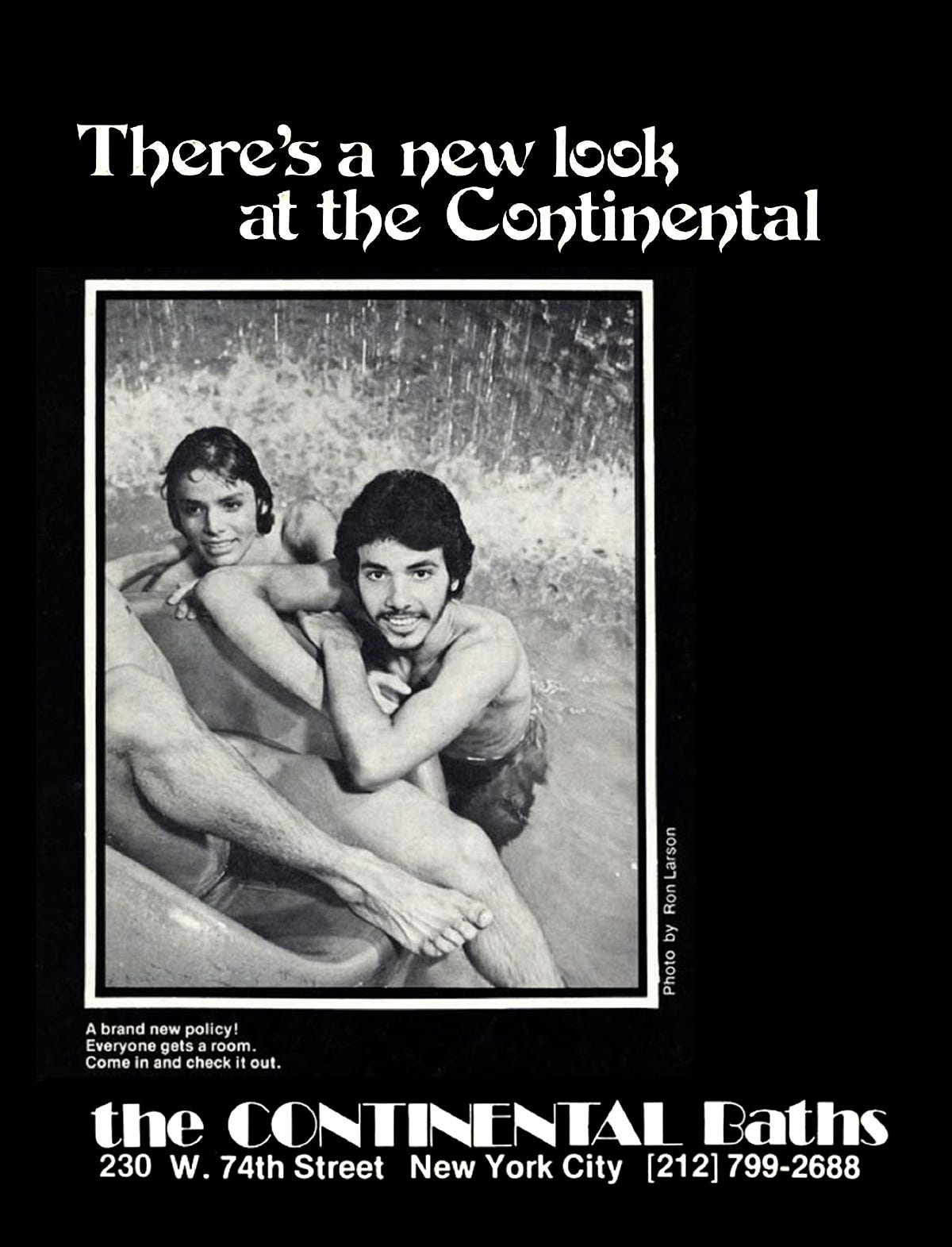
Bathhouses popped up in cities in the late 50s and offered a safe haven—at least temporarily, before becoming subject to police raids—for gay sex and community. In addition to being a grounds for cruising, bath houses were a place of entertainment. The renowned Continental Baths in New York even gave rise to broadway star Bette Middler, who would often perform there in the early 1970s.
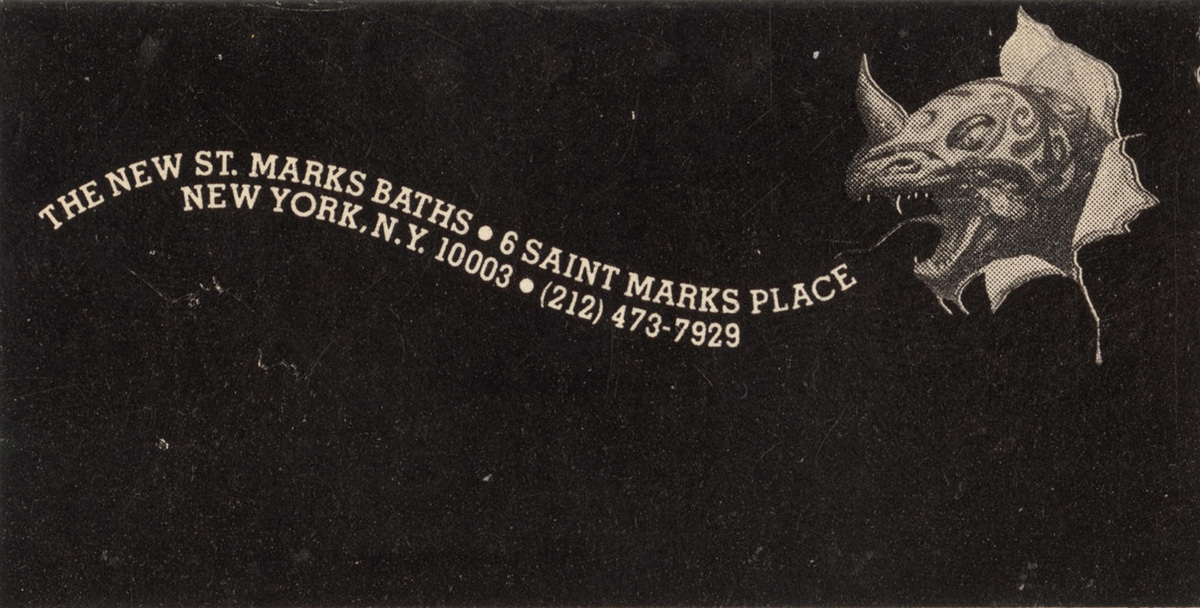
The bathhouse posters themselves often included black and white photography and illustrations depicting idealistic nude men enjoying each other's company—or seducing the viewer. The posters were overtly sexual and unapologetic. Though the designers of these posters are largely unknown, they would sometimes borrow imagery; a poster for St. Marks Baths co-opted an illustration, Mysterious Rider (1978) by Boris Vallejo for an advertisement.
The posters were riddled with pleasure and excitement. The provocative imagery offered an innate rebellion, demonstrating that “sex sells” long before this idea made its way into mainstream advertising. However these posters did more than sell: they fostered community in a time when it was needed most.
In an attempt to stay loosely on theme, this issue's featured archive is the Houston LGBT History archive—specifically, their collection of publications from inside, and outside, Texas. Their collection is wonderfully vast, ranging from maps of gay bars to periodicals about queer theory, but all of them contain a fantastic range of expressive type, quirky illustration and excellent writing.
Last week on Valentine's Day I released a new riso-printed publication, “How to Live on Love", which includes an essay on the history and design of romance novels, as well as a wide assortment of lettering samples pulled from erotic pulp covers from 1945-1985. The zine is available for pre-order here on the High Tide web shop. Pre-orders close tomorrow, so get it while it's hot!


