

Ice Ice Baby
Hitting you with an ice-cold issue just in time for the last gasps of summer! This one comes to us from British writer Kris Kozlowski Moore, who has written about everything from Spanish photography books to lawns. Today, he takes on Japanese ice cream packaging.
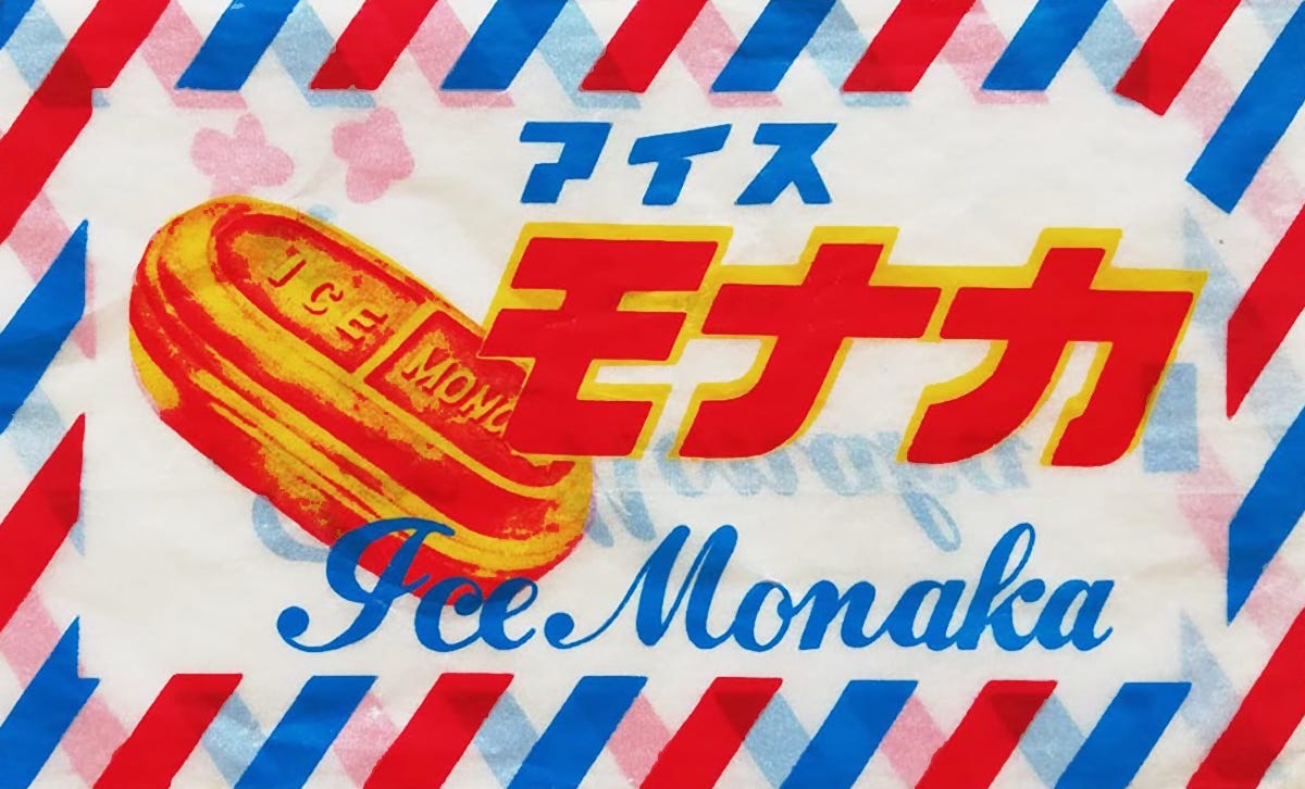
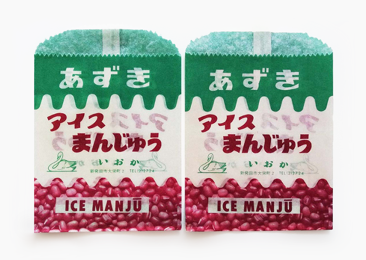
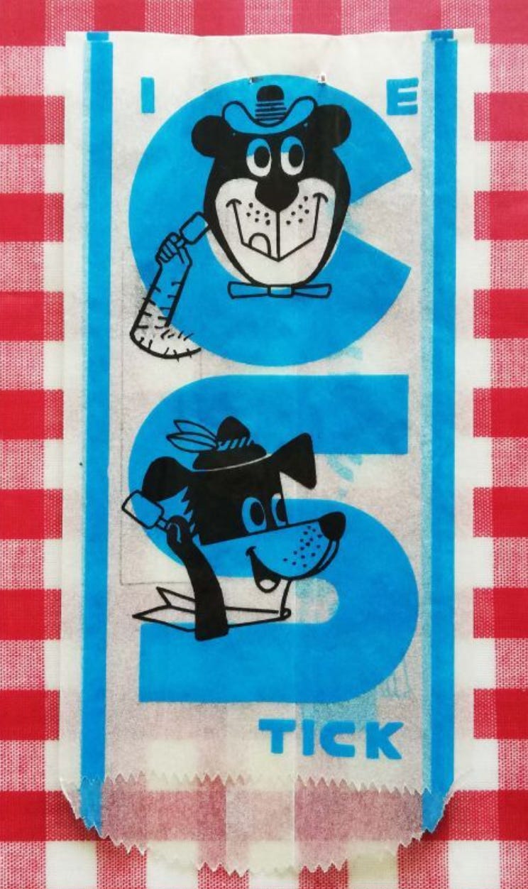
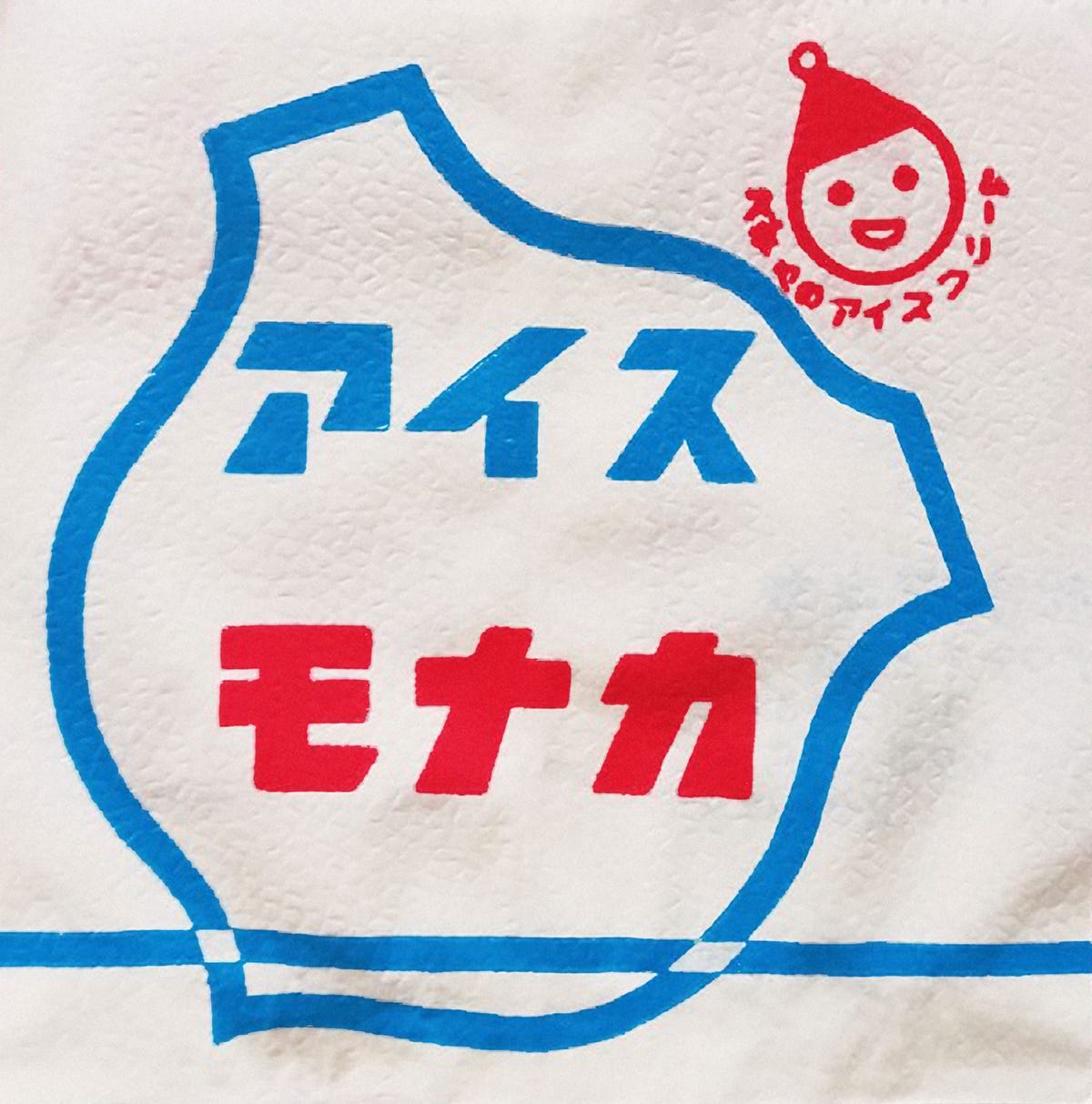
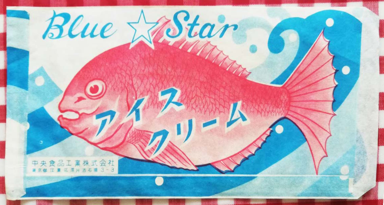
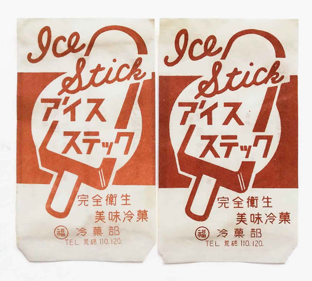
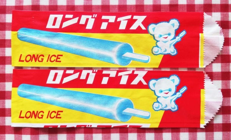
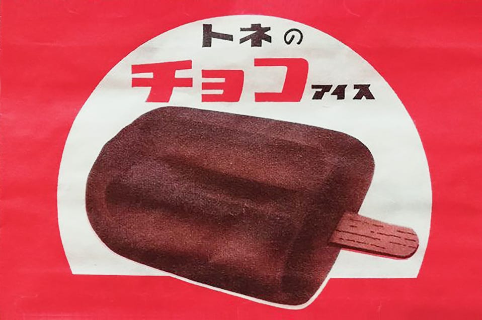
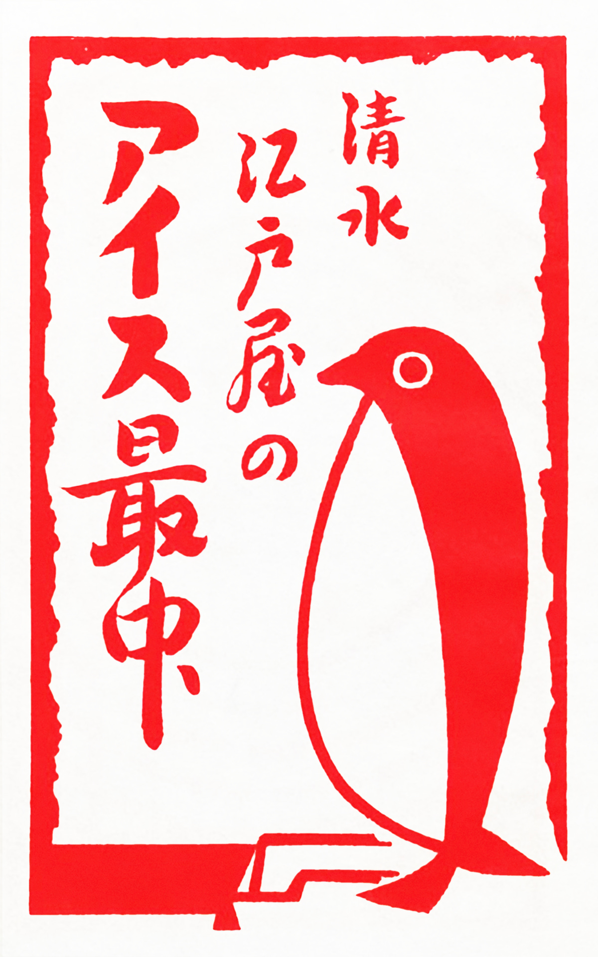
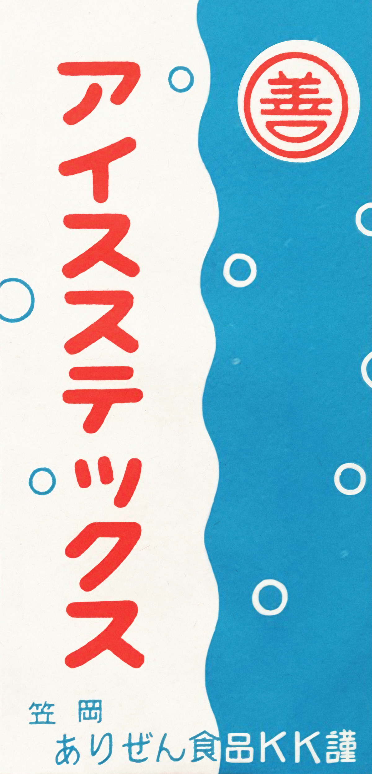
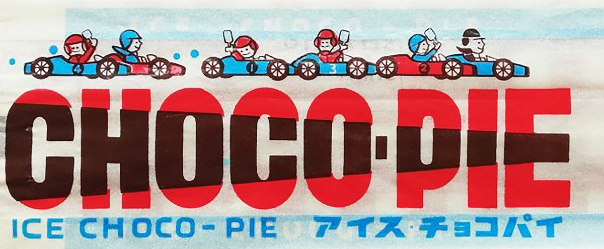
This is a collection of Japanese ice cream bags. Most are for ice cream monaka, a modern take on traditional monaka, which are sweets made from azuki bean paste sandwiched between two rice cake wafers. I didn’t know ice cream bags like these existed until Elizabeth shared the collection on Twitter. I don’t actually like ice cream that much (it makes me thirsty) but I like these ice cream bags, mostly because of their kitschiness, gaudy colors, and innocent joyfulness. These last two things, innocence and joyfulness, also put many squarely in the world of “kawaii,” Japan’s culture of cuteness.
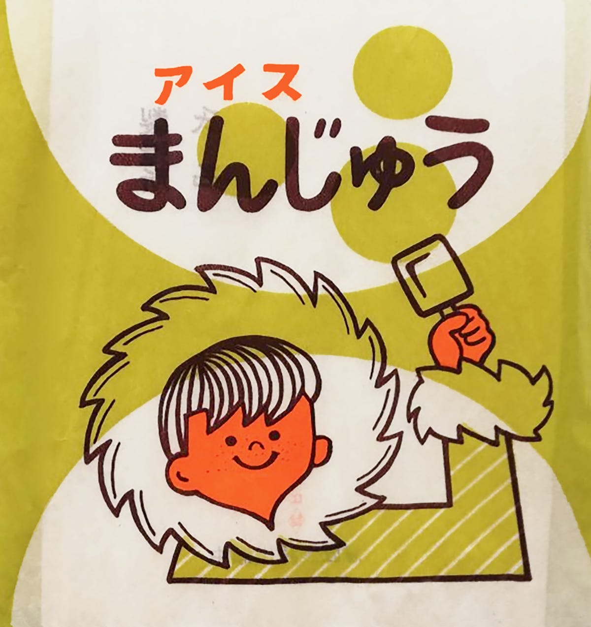
On one ice cream bag, a smiling boy with a fur coat—an admittedly outdated and trite Inuit reference—triumphantly holds up an ice cream. Here, ice cream is equated with happiness so simply that it almost feels naïve. And I don’t mean that in a derogatory way; it’s desirable because of this rose-tinted outlook. Ice cream: happiness. Above the boy are the words “アイス まんじゅう,” or “ice manjū” (manjū being a traditional sweet encased in a soft wheat dough). The font is drawn with rounded edges and uniform thickness—a good example of kawaii typography, called marui-ji, which literally translates to “round writing.” Marui-ji first appeared in the 1970s, brought into existence by a group of teenage schoolgirls who started writing laterally instead of vertically, the opposite of how Japanese is traditionally written. The style was considered difficult to read and became seen as subversive, which led to many schools banning it. Of course, as with any rebellious act wrapped in red tape, it simply flourished elsewhere, soon becoming the defining typographic style of kawaii.
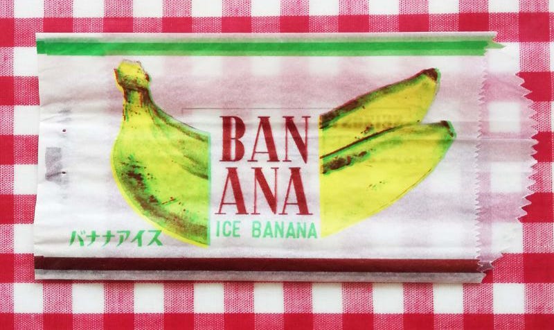
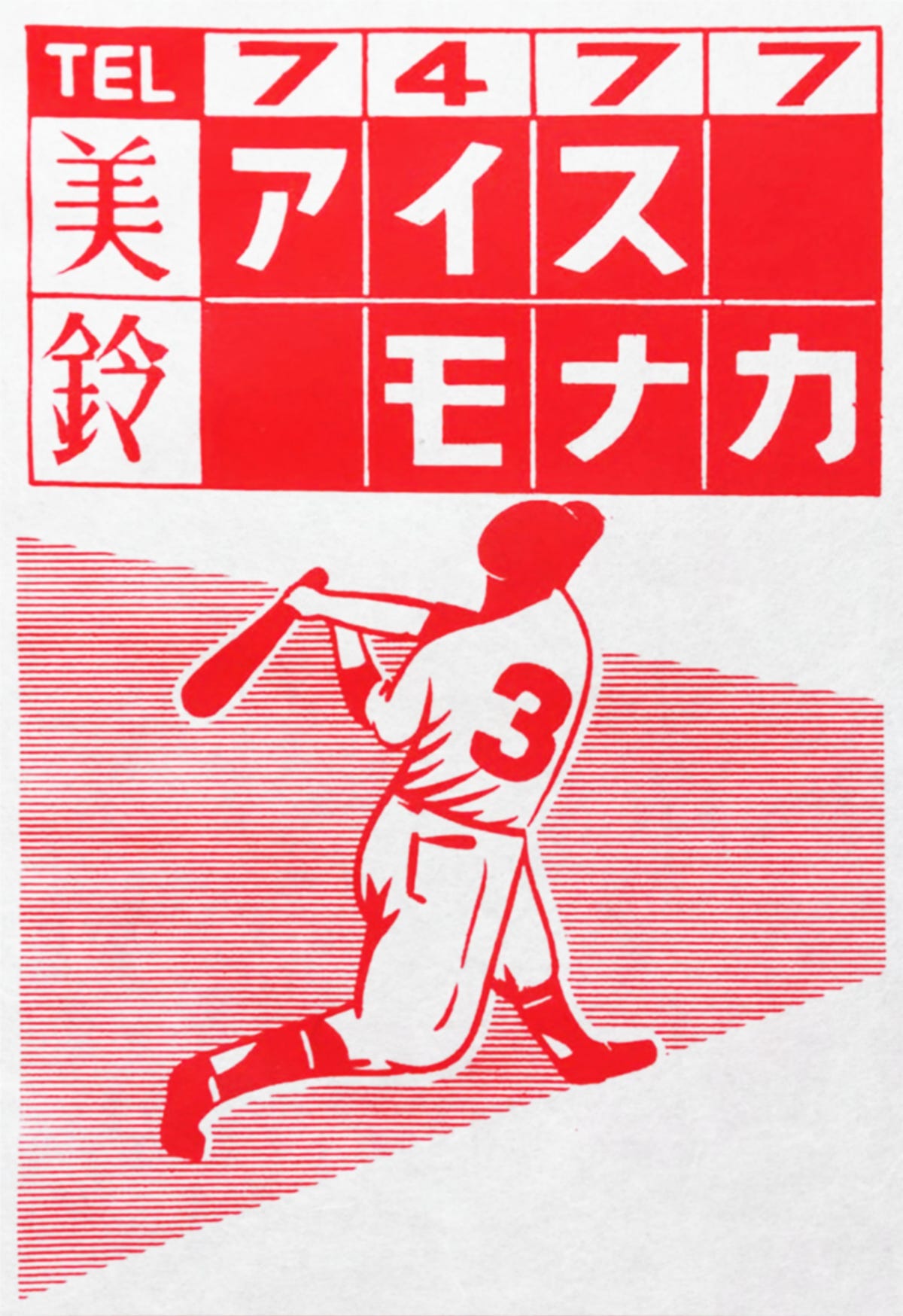
Other ice cream bags from the collection are far from the world of kawaii. Amongst them I find jelly on a plate, pirate ships and fruit. All the designs fall squarely into that endless well of items designed by someone and no one. I like thinking about these anonymous hands at work: who decided that baseball was to going to be the cover of the next ice cream bag? Who made it look so beautiful? Where did they find all these images of bananas? Do they even like bananas? I’ve always liked these types of thoughts and how they can spring from the most fleeting of things, including ice cream bags.

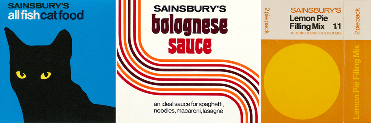
This issue's featured archive is the Sainsbury's Archive, which I have been evangelizing since at least 2019. Sainsbury's is a British grocery store chain founded in 1869 that is still thriving today as the UK's second largest supermarket brand. They've long produced their own line of groceries and home products, and given their long lineage, every era of Sainsbury's packaged goods serve as a little window into the trends of the time, from decorative tins to comically minimal modernism.
I was recently featured in a piece by It's Nice That about contemporary creatives who weave archival practice into their work. It's a huge honor to share space there with my friend and collaborator Daniela Spector as well as many other creatives I profoundly admire like Mindy Seu!