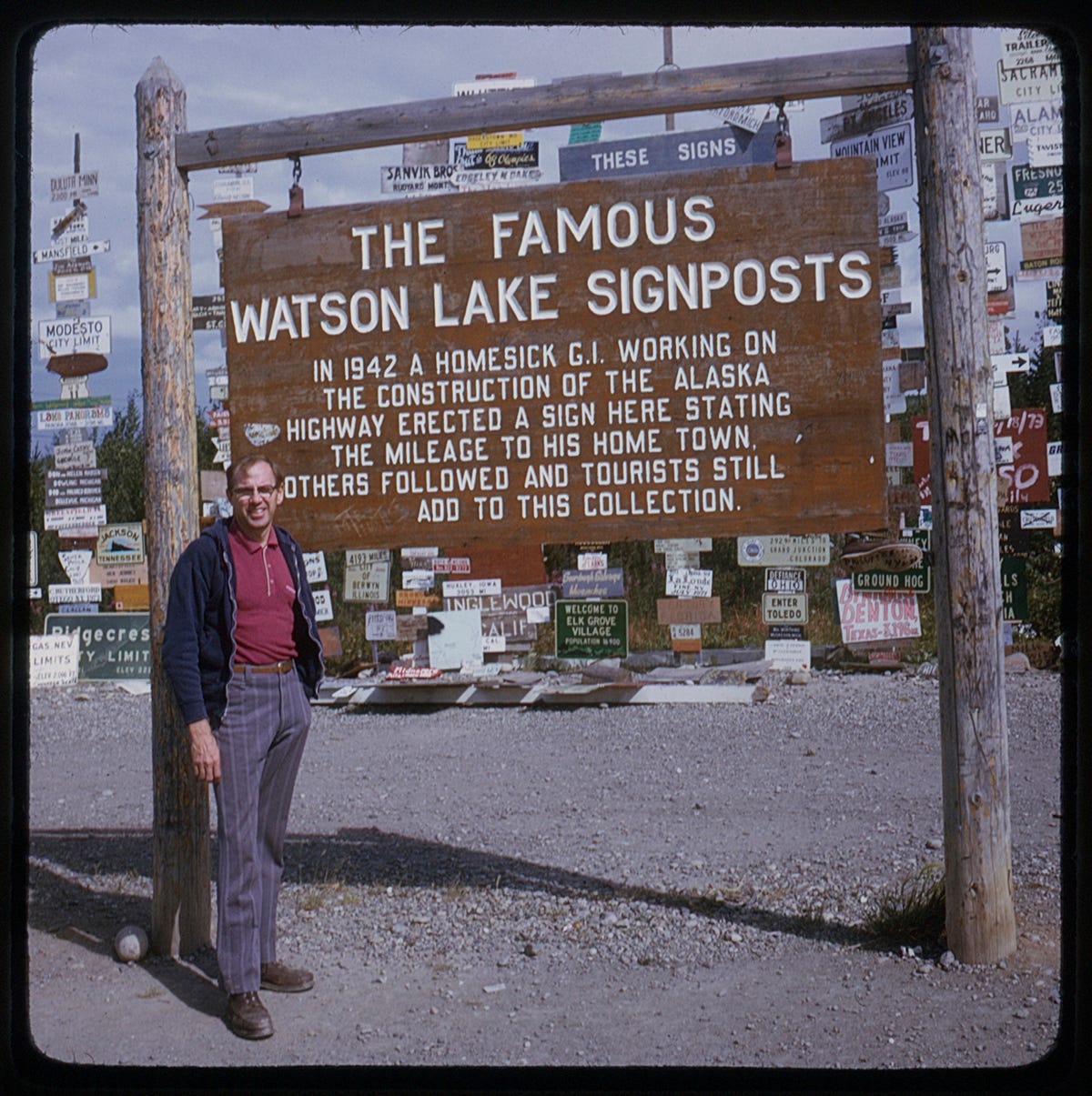
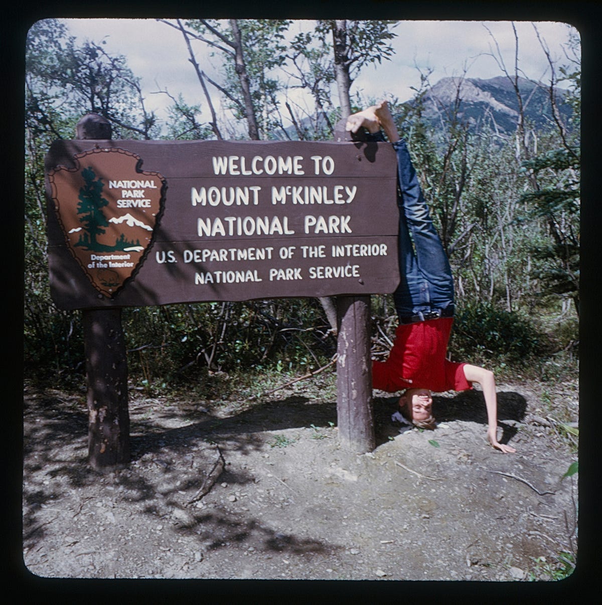
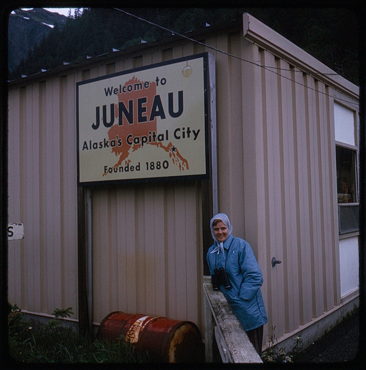
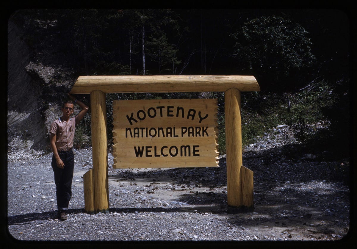
Today's issue comes to us from photographer and archivist Daniela Spector (who was also mentioned in our prior issue as part of It's Nice That's feature on artists who work with archives!) I've been an admirer of Daniela's work as a photographer for a few years and have gotten to know her better since we collaborated on a shoot for kid's magazine Anyway last year. Daniela has an amazing eye for trends and patterns, as evidenced by her rigorously maintained Are.na, as well as an admirable rigor when it comes to documenting history—her own and that of anonymous photographers across time. This newsletter takes up the spirit of the latter, looking at a peculiar trend of 20th Century vacation photography: photographs with signs.
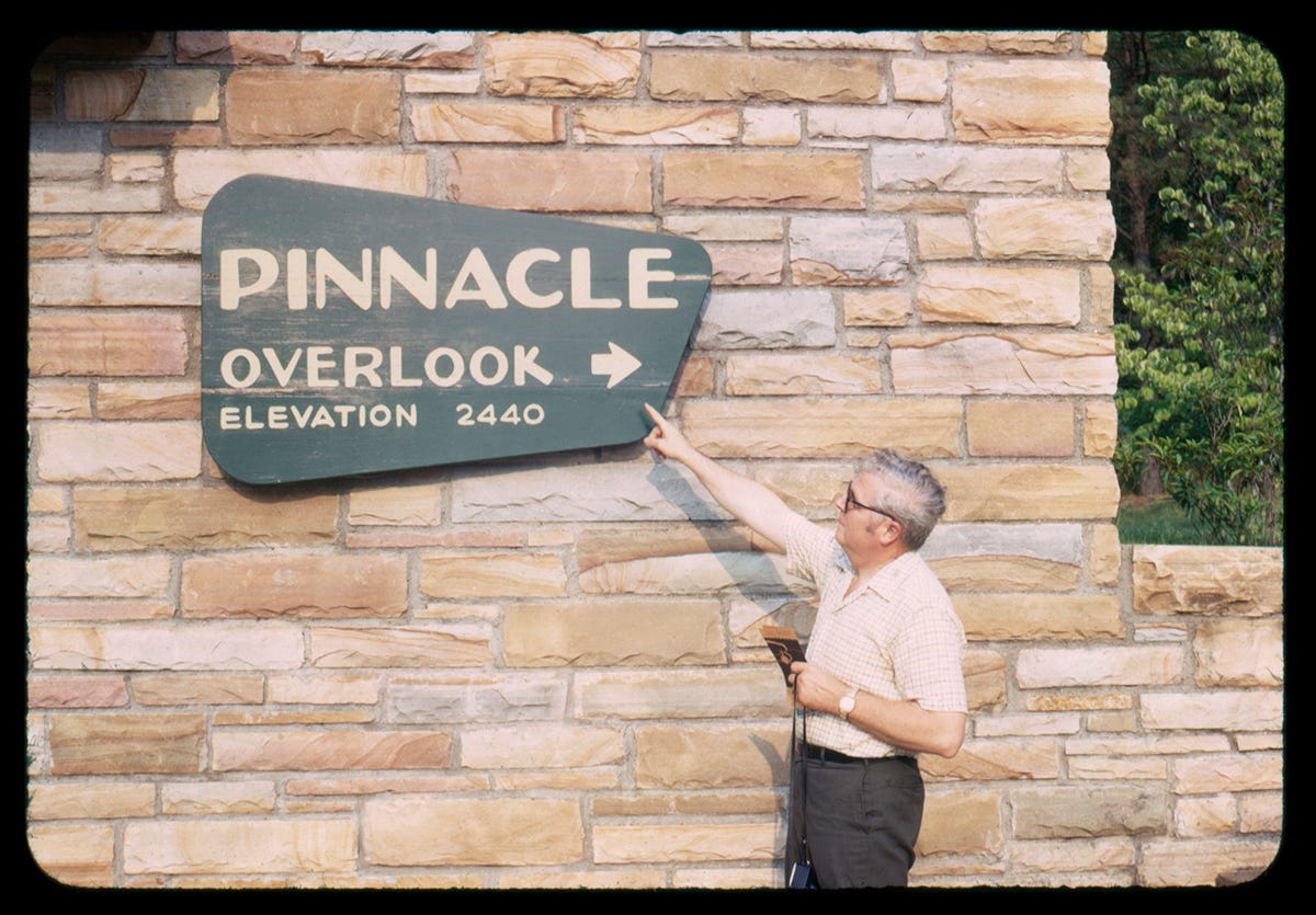
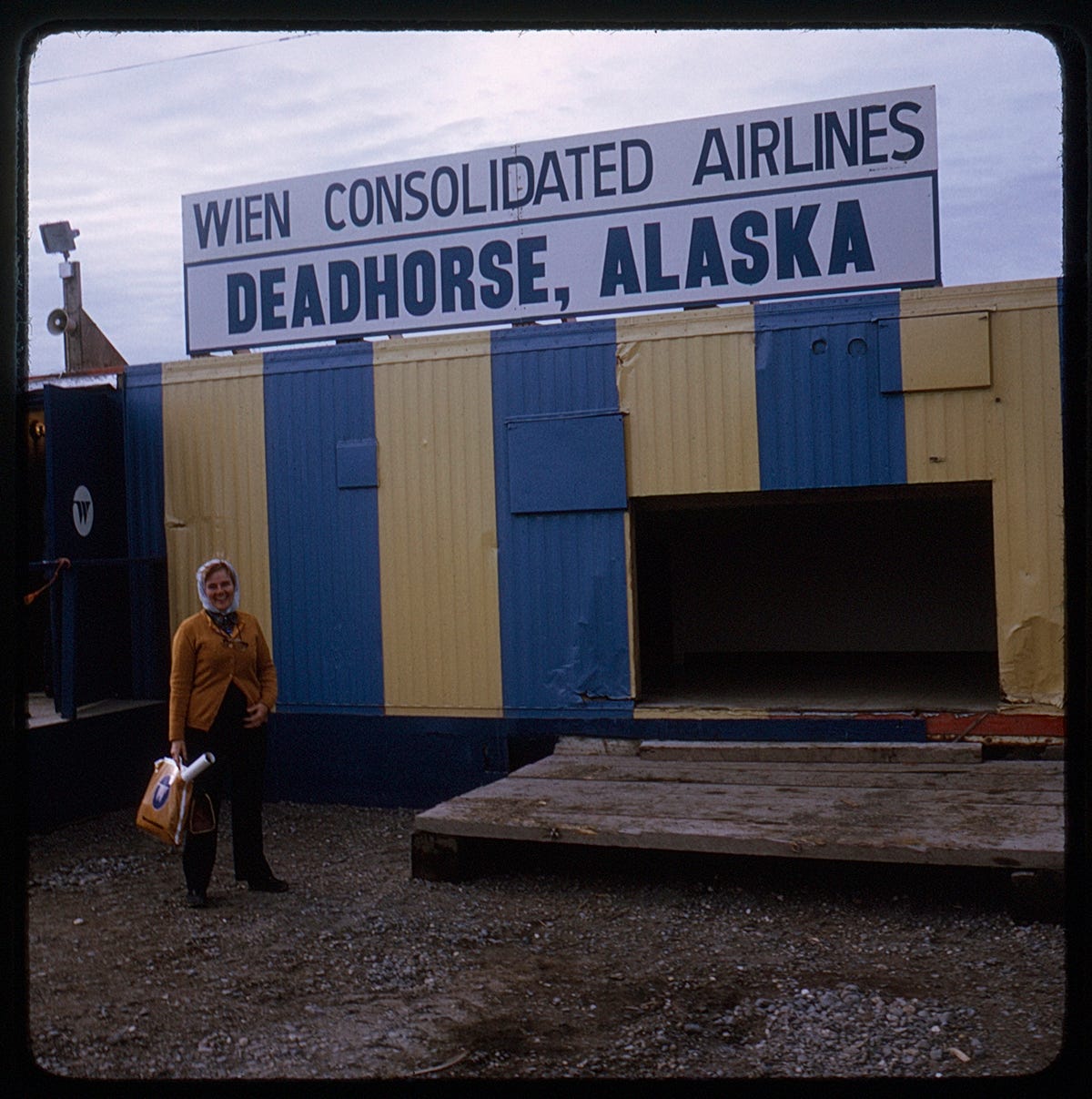
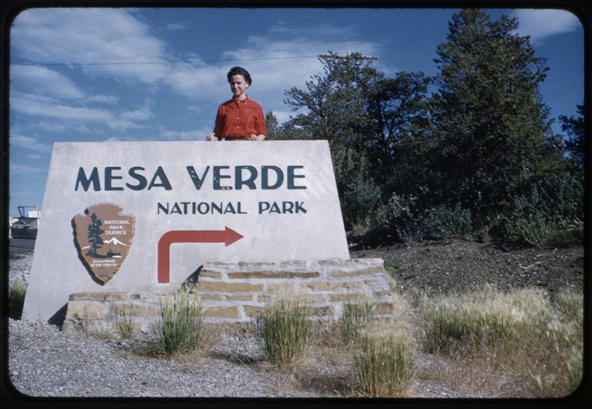
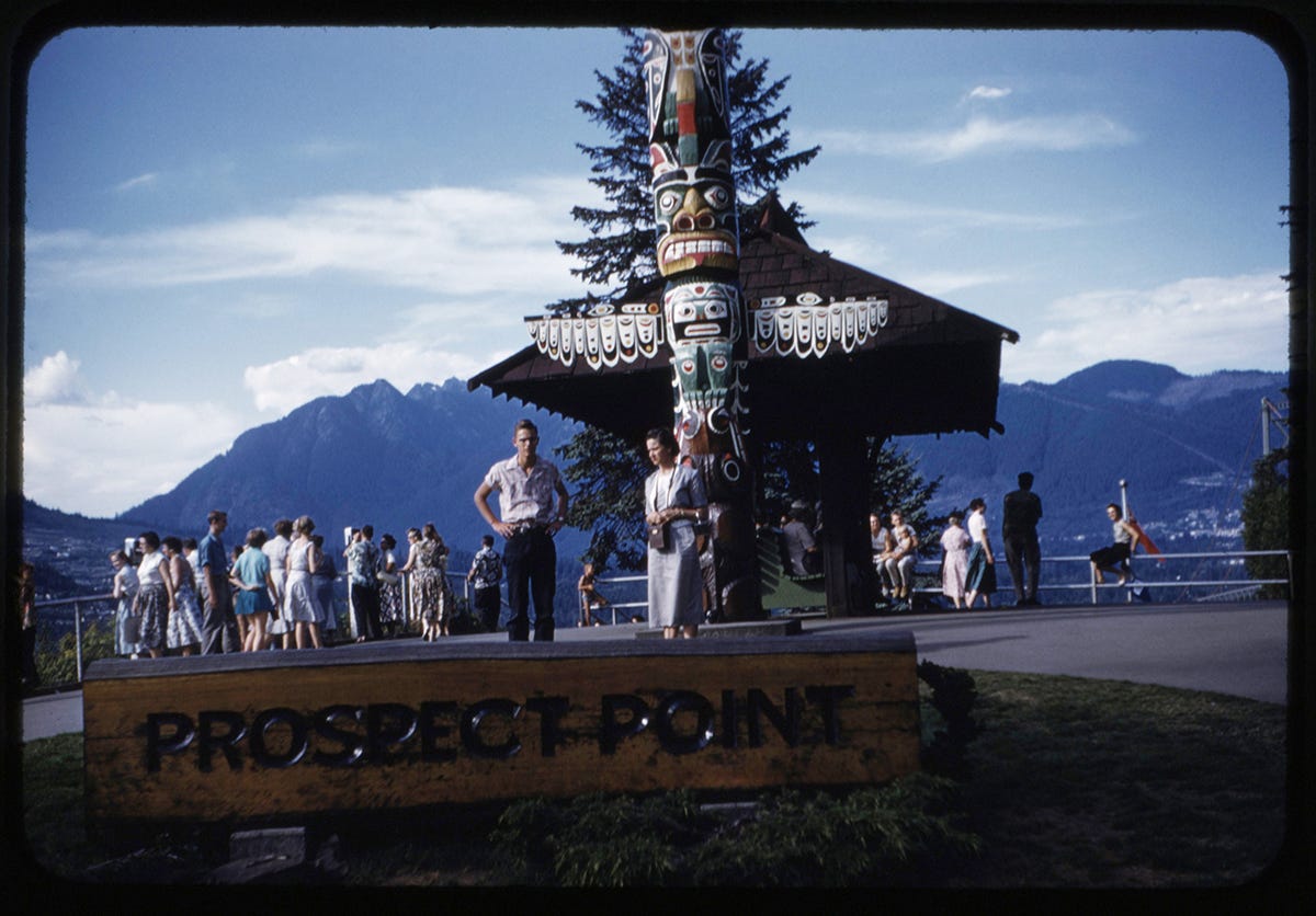
I started collecting found film slides in April 2021. The explanation of why I started collecting them is unnervingly similar to the plot of If You Give a Mouse a Cookie, so I’ll spare you the backstory. The addictive pull towards collecting them is simpler⸺Charm! History! It’s also an interesting practice in personal curation. To understand what you do or don’t like in an image. To find patterns. One of my favorite patterns that I’ve stumbled across is this collection of film slides from the 1950s-1970s featuring travelers posing near outdoor signage during road trips.
The burgeoning popularity of documenting the family road trip with increasingly portable cameras was the culmination of three inextricably linked variables: a war, a boom, and a highway. After World War II ended in 1945, swaths of men returned to America, unsettled and restless. Many of those men became fathers, and many more became prosperous with the economic boom that began in 1950. Six years later, President Eisenhower signed legislation funding the construction of the U.S. Interstate Highway System. Nearly 85% of Americans “hit the road to vacation fun,” as the trend was described in a 1965 Times article. The signage also evolved during this period, from the “Rustic Style” of carved wood and ornamental bases to the “Mission 66 Style” of park themes and the National Park System’s arrowhead logo to the inevitable and depressing “Highway Safety Era.”
A generation of dads packed up their station wagons with their cameras, disposable incomes, families, and the newly opened roads that connected America to embark on the family road trip. Stopping along the way to document their vacation by incorporating signage that doubled as metadata captured within the photo and proof of the milestone achieved. The result is a series of images that remind us the journey is just as important as the destination.
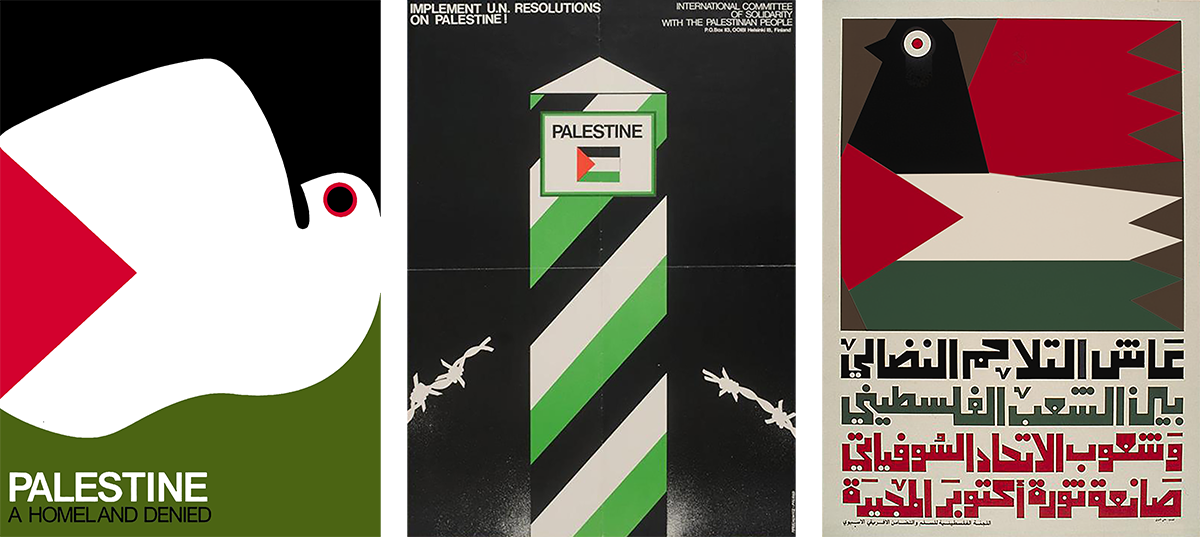
This issue's featured archive is the Palestinian Poster Project—in particular, their Liberation Graphics Collection, which showcases posters published by the Palestine Liberation Organization (founded in 1964) that call for Palestinian self-determination and solidarity with other groups oppressed by imperialism, fascism, or colonization. Free Palestine.
I wrote and illustrated an article for issue 33 of Port magazine about the thorny relationship between historic countercultural movements and contemporary wellness brands (i.e. Whole Earth Catalog meets DTC vitamins). I also wrote a piece for It's Nice That last month exploring originality in rebranding and the impact that shortening timelines and economic tensions are having on the brand design world.


