


And Also With You
Today’s collection is a set of Christian propaganda posters printed and distributed across China from the late 1920s to the early 1950s. While missionaries had been traveling to China for over a century by the time posters like these first appeared (the first Protestant missionary, Robert Morrison, arrived in 1807), during the Republican era from 1911–1949, the country’s fractured leadership and ideological clashes created an especially ripe opportunity for missionaries to spread their message before another government took hold. Street preaching was common but often ineffective: language barriers and competition for attention limited speakers’ reach, and in most regions, public evangelism was seen as disruptive, aggressive, and even embarrassing. Posters, on the other hand, could be disseminated widely in a range of languages and more easily integrated into public Chinese life.
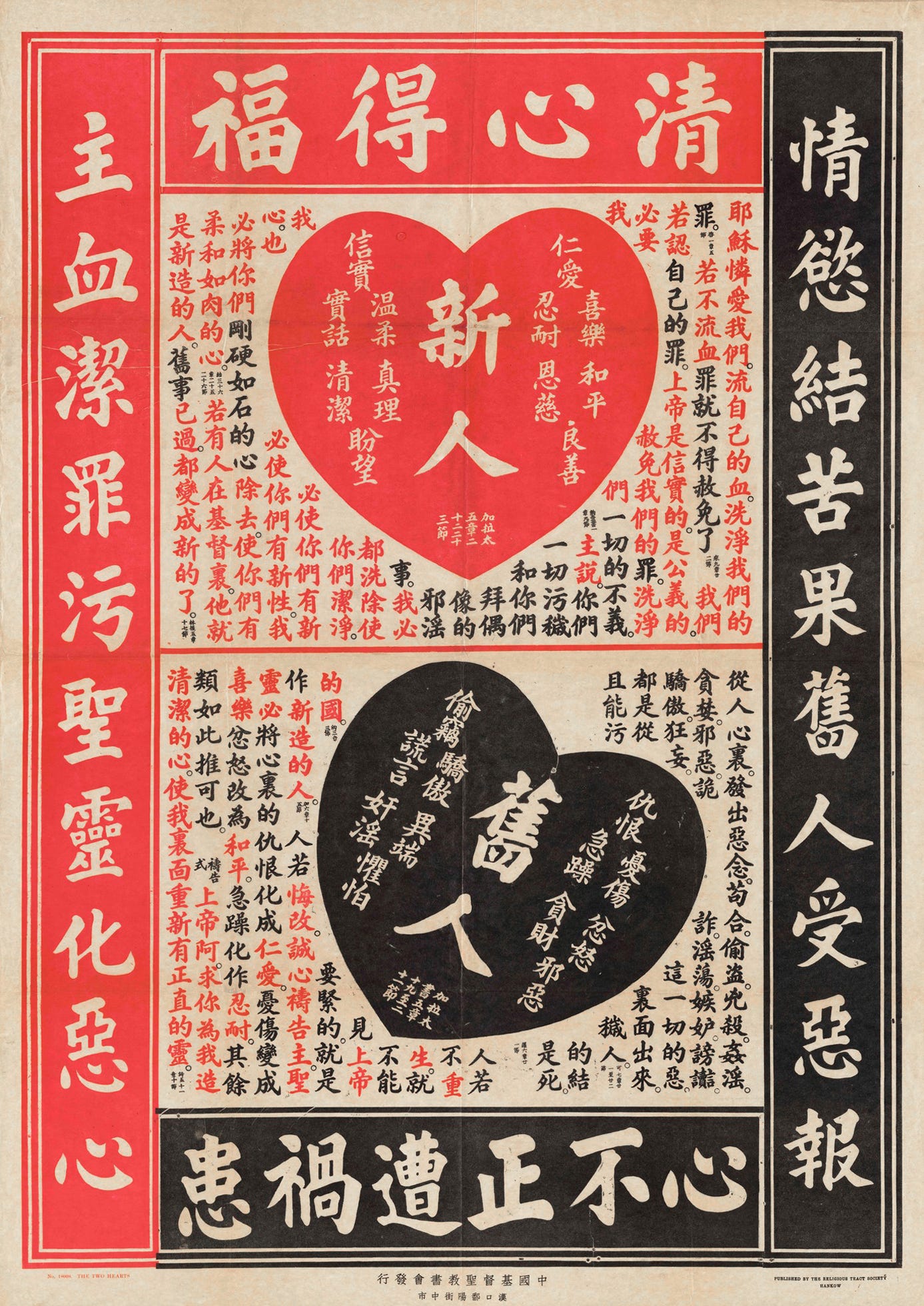
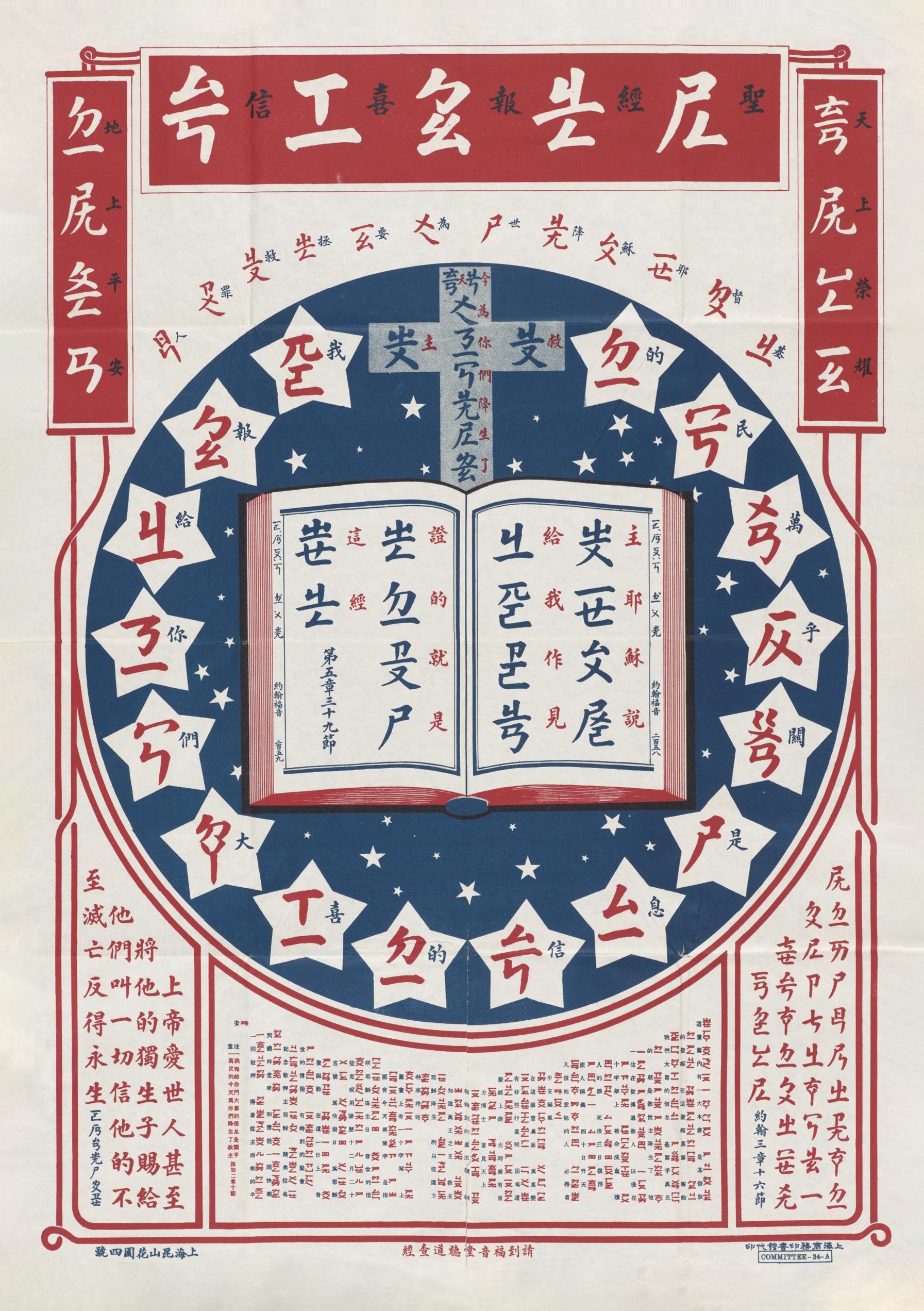
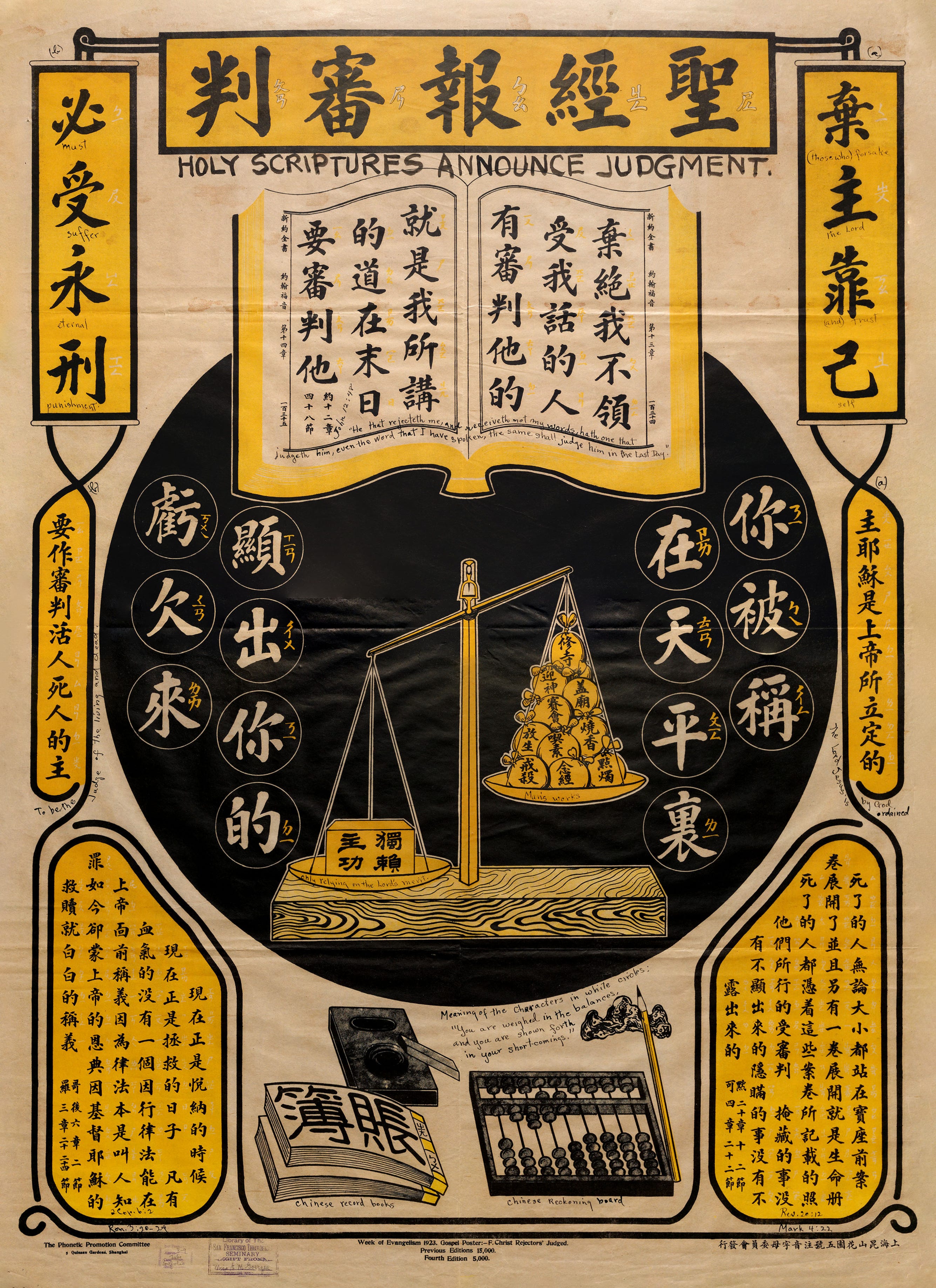
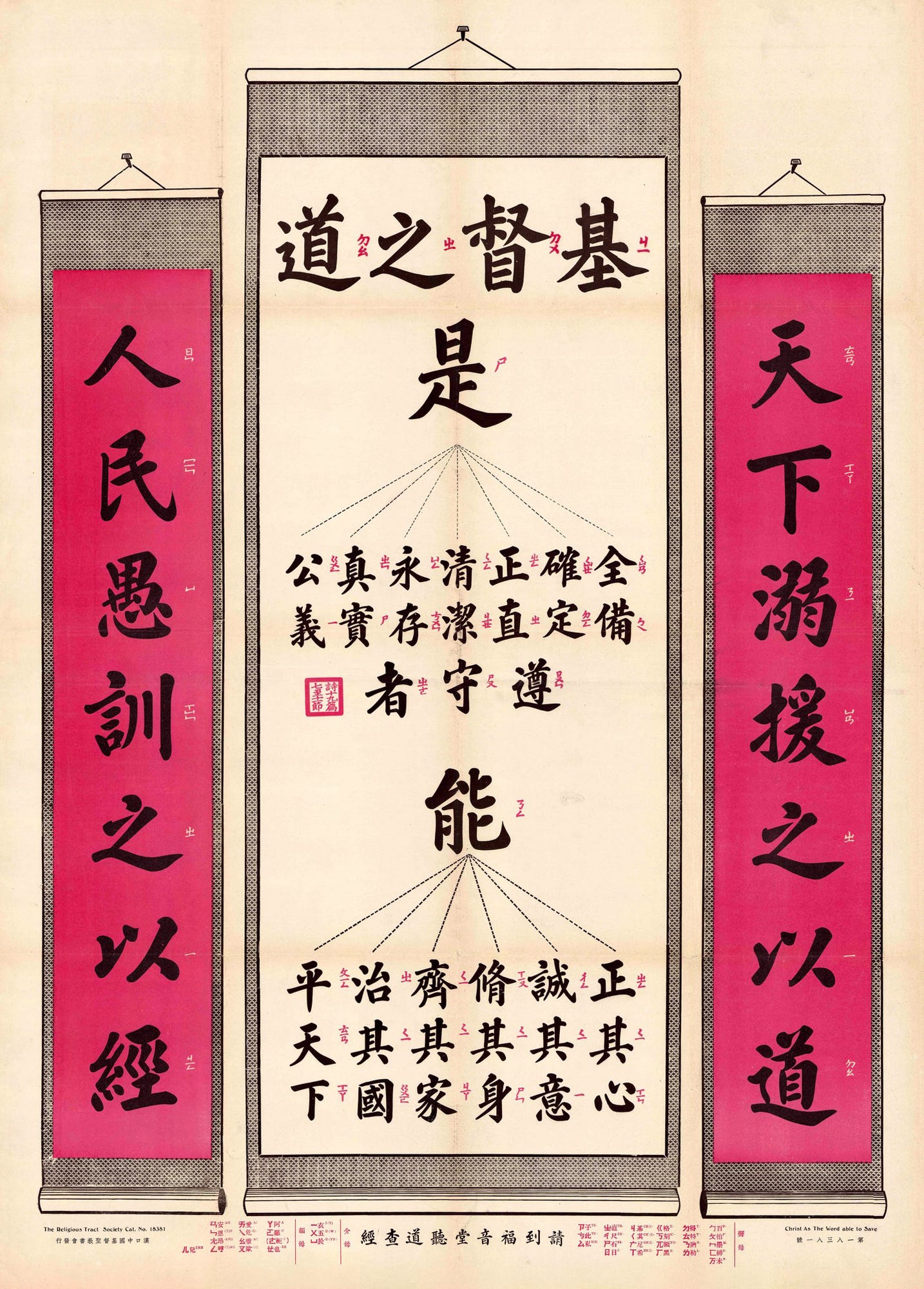
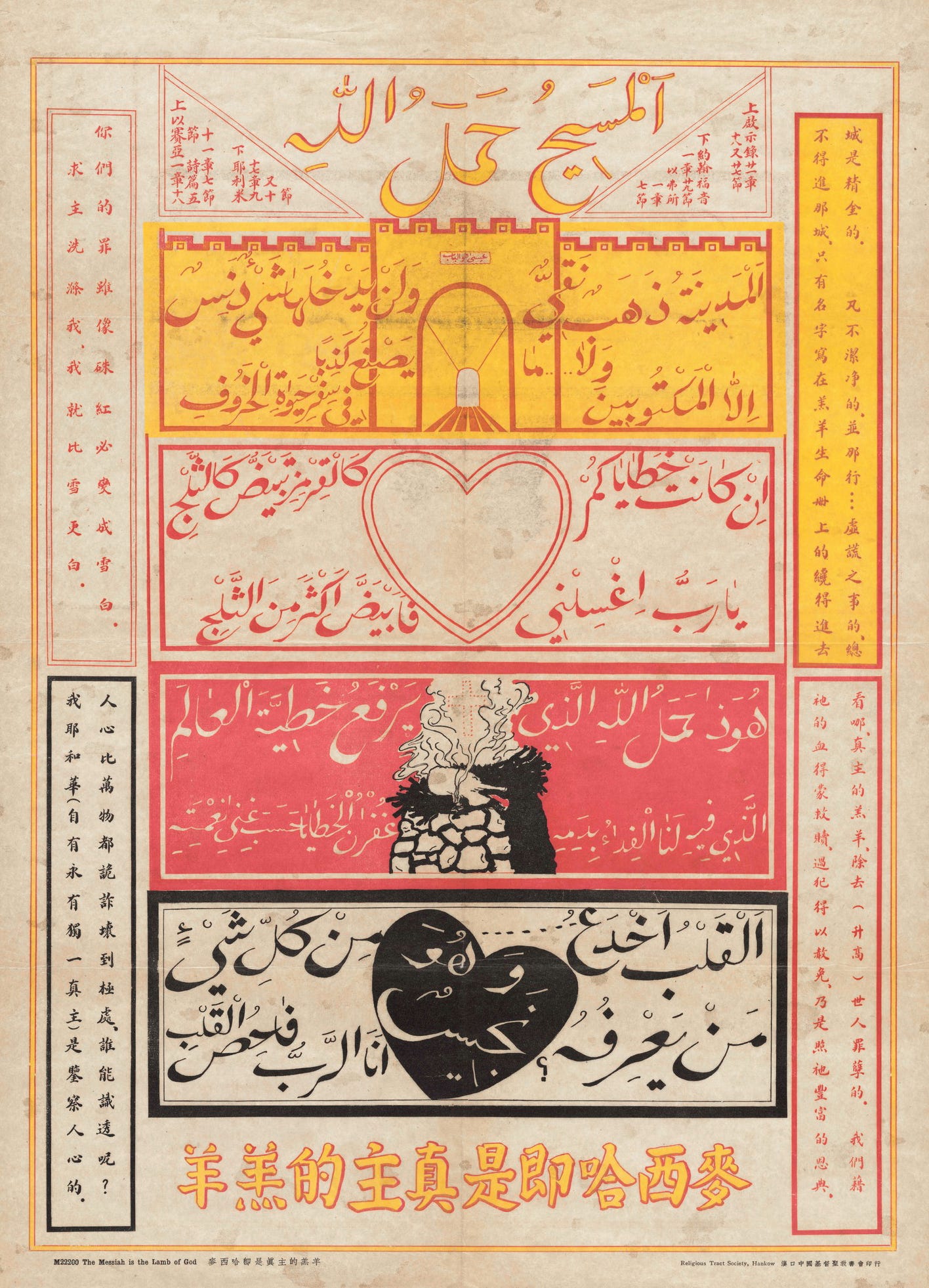
These posters were created by missionary organizations and Chinese Christians alike, and covered religious doctrine and Bible stories as well as advice on subjects as myriad as admitting wrongdoing, killing flies, and proper air circulation during sleep. Their remit was difficult—they needed to introduce radical ideas, visually compete with more familiar political and religious ephemera, and also be affordable to print at a large scale and in large quantities. The result was a style defined by symbolic density—combining Western imagery like crosses and sacred hearts with Chinese iconography like abaci, lotus flowers, and zodiac animals—bold, minimal color palettes, and confident typography.
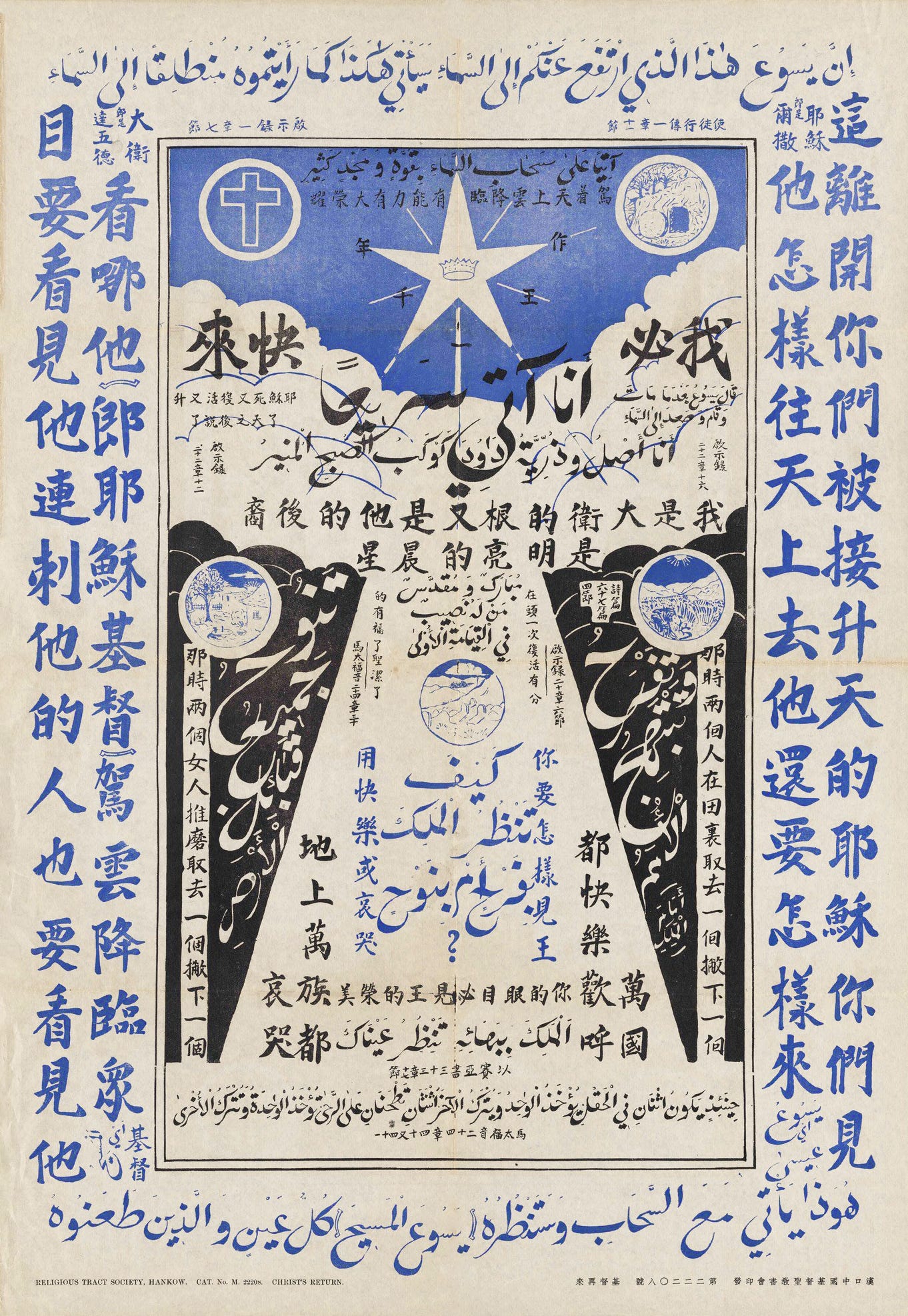
Many remapped familiar Chinese visual traditions onto Christian content: the Virgin Mary rendered as a Ming dynasty noblewoman, or a guide to communion designed with flattened perspective and decorative framing reminiscent of Buddhist cosmological diagrams, which use segmented layouts to structure complex moral or metaphysical ideas. Other posters were tailored to specific minority groups, such as the Hui Muslims, and combined Mandarin with Arabic or Tibetan script to proselytize across languages and faiths.
While the densely illustrated posters are more visually rich, I find myself most drawn to the simplest posters, like the ones I included here. They make clear how little it takes (visually, at least!) for a message to assert itself, even across unfamiliar ground.


Just too late for Pride: this issue’s featured archive is the the Gay Rodeo History archive. I feel that this one is relatively self explanatory, and if the name alone does not warrant a click, I really don’t know how to help you.
Someone once told me to never apologize for not sending out my newsletter. So I won’t!!! But… since it’s been a minute, I do have a handful of updates from the past few months: I’ve written about ennui in the design industry, using the past as a stock library, unintentionally-good and intentionally-bad branding, Playlab’s 20th anniversary, and radical haggadot. I also gave a talk at the Typographics Festival last Friday (which you can watch online for a few more days) and a talk at the Type Director’s Club about the typography of vintage porn (which you cannot watch online, but which hopefully someday I will find a way to write about on here without being cancelled). On the design front, I designed and art directed the vinyl for A24’s new movie Materialists (which you can pre-order here!) and did a special cover for Antiques Magazine—plus work for a jewelry brand, a no-ABV beverage, and a board game, all coming soon <3
"and also with you" -- can't not hear it through Fleabag's voice
Great collection! Thank you for the links at the bottom -- I have some catching up to do
Very cool as always! One question, why “regime” instead of government?