

Understood the Assignat
Today’s guest issue comes from Polina Godz, an art director at Jacobin + Tribune as well as a writer with a focus on the intersection of design, architecture, and politics—including a recent piece for New York Review of Architecture. She was also my college roommate (here we are in Saint Petersburg in 2013), and remains one of the smartest people I know.
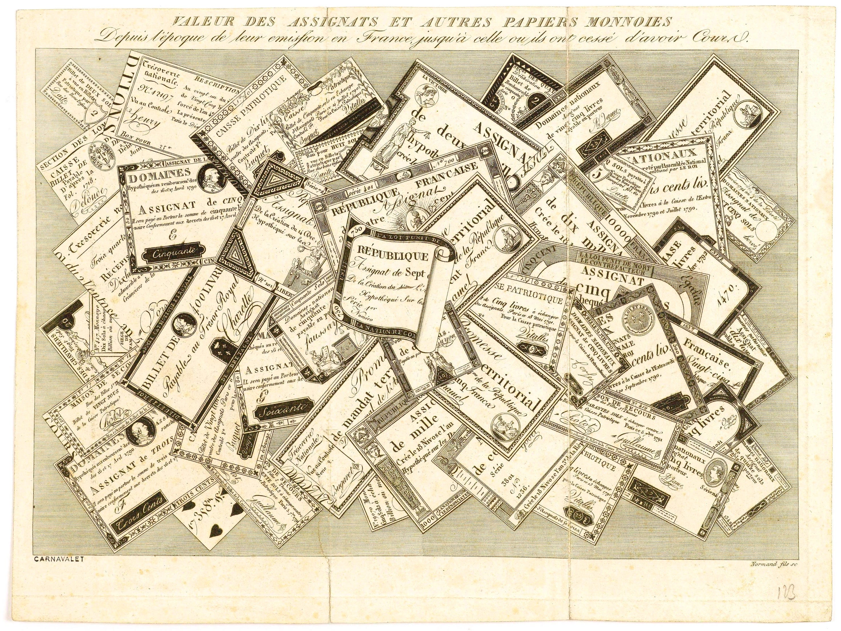
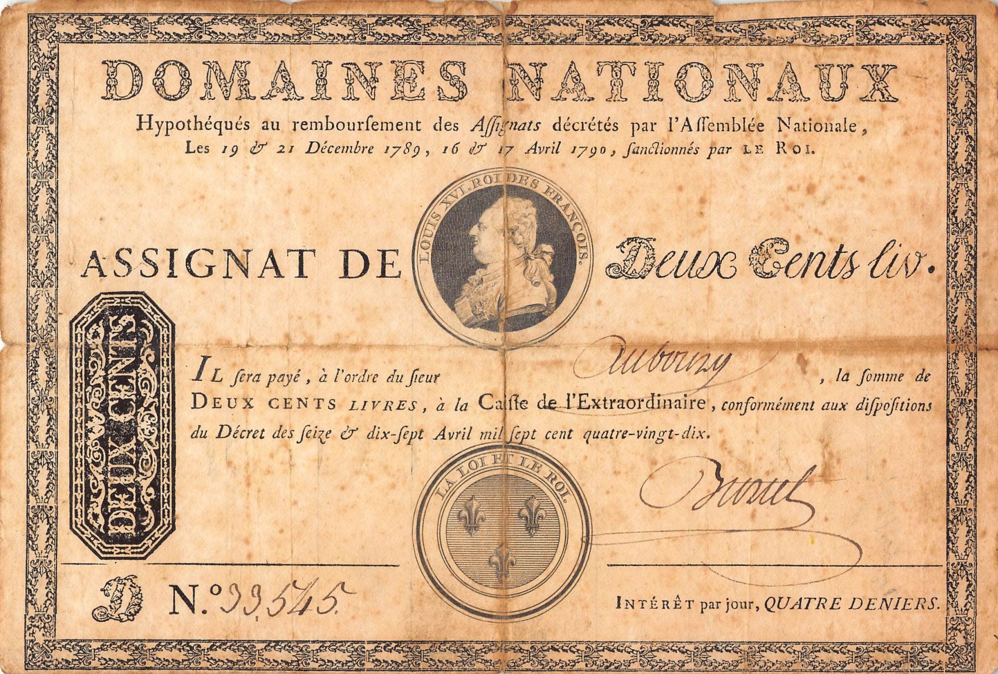
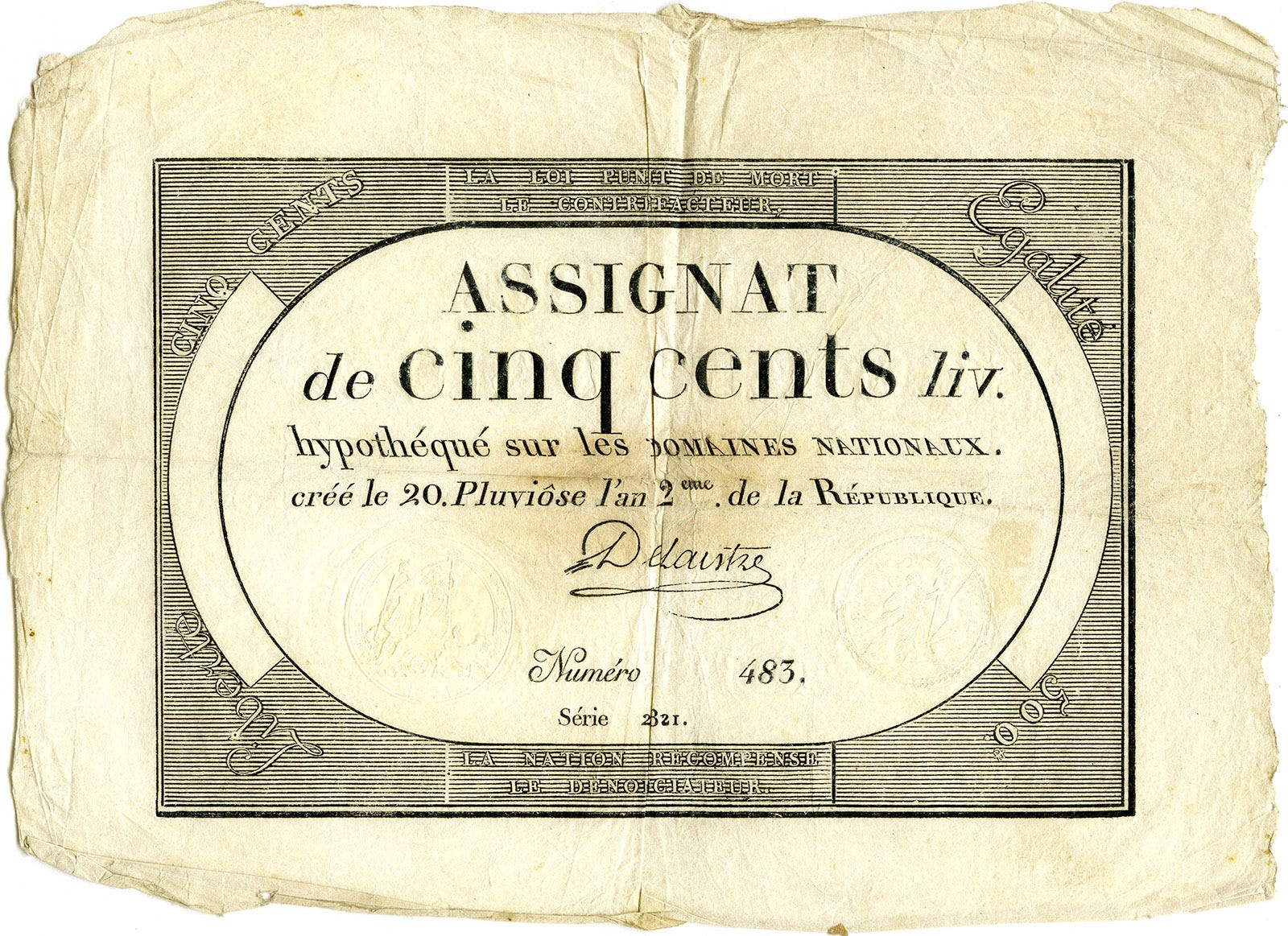
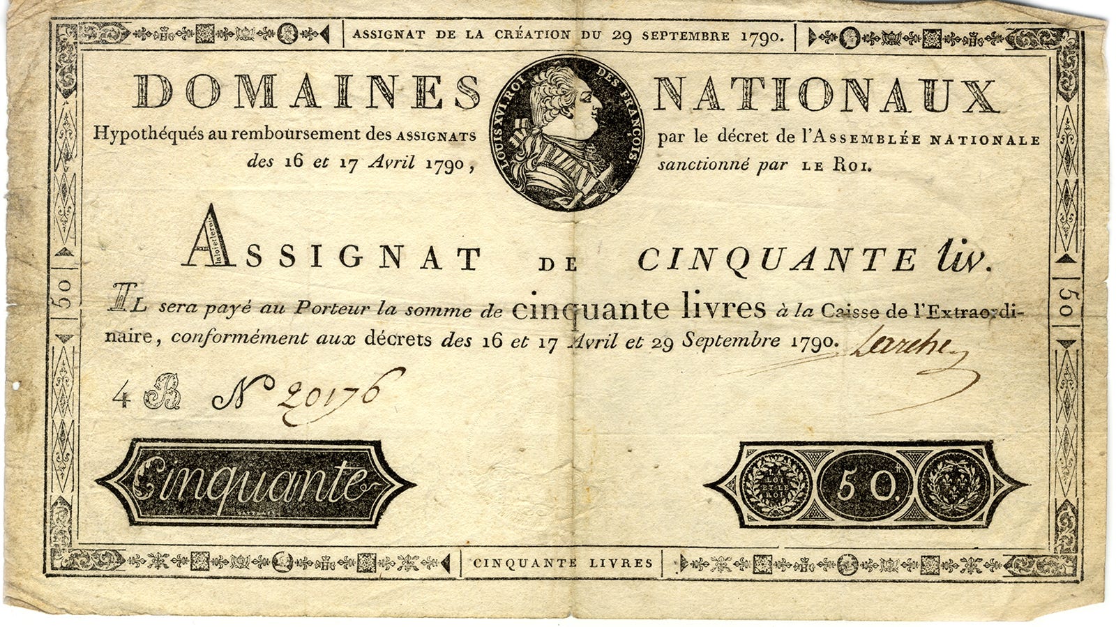
This fall, I spent several afternoons exploring the archives of the Museum of Living History in the suburbs of Paris, searching for typographic inspiration related to French political history. While there, I came across a stack of assignats—a form of currency issued in the aftermath of the French Revolution—and immediately wanted to know more. What is the history behind this type of money? Who were the engravers who so skillfully adorned these proto-banknotes with a blend of revolutionary symbols and classical ornaments? Who were the typographers who chose to mix proprietary fonts of the Royal Printing House with custom characters, whimsical ligatures, backslanted and inverted letters? And, most importantly, why?
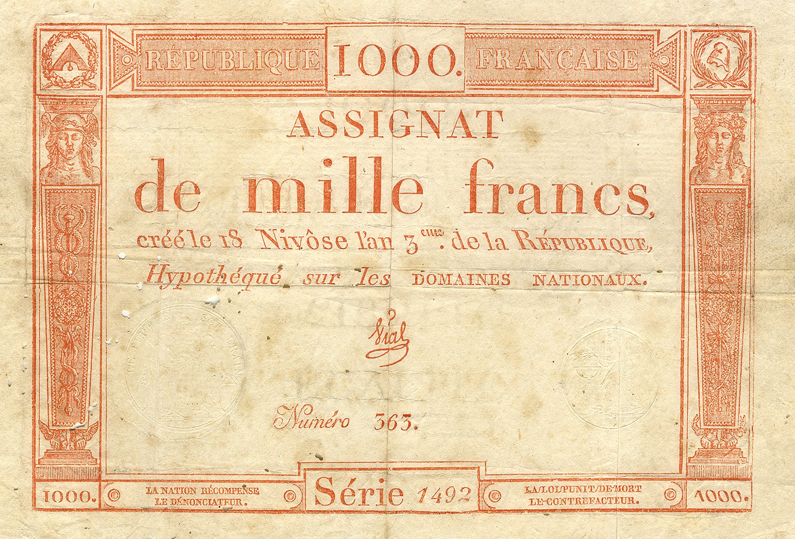
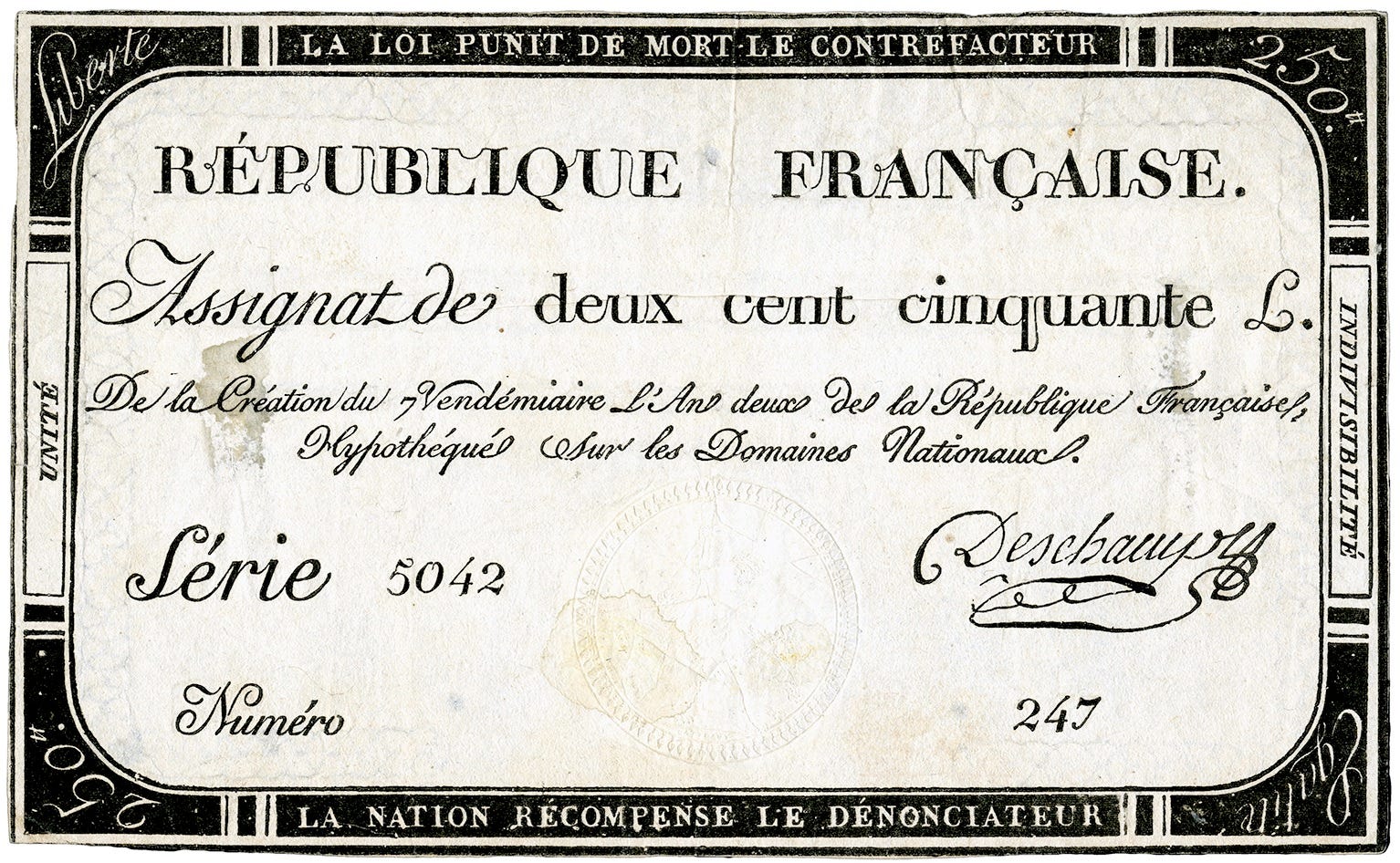
A few days of research and an email to the Lubalin Center’s Sasha Tochilovsky later, I had some answers. Assignats were a revolutionary form of currency backed by the value of nationalized properties previously owned by the king and the Catholic Church. They were only in use for about a decade but underwent several notable transformations reflecting the timeline of the Revolution as well as improvements in the printing technology. For instance, earlier examples still referenced the king and used a traditional date format, while those issued after 1793 adopted the French Republican calendar. The visual design evolved as well: the first series of assignats featured the Romain du Roi typeface—the proprietary font of the Royal Printing House, recognizable by its signature spur on the lowercase “l.” But after 1790, the printing of assignats fell under the purview of the Didot dynasty, with Pierre supervising the process and his brother Firmin overseeing typography. Before himself designing a proprietary typeface for what became an Imperial Printing House under Napoleon I, the latter imbued the revolutionary money designs with high-contrast geometric forms evocative with the family name Didot. He also used his typographic expertise to differentiate the authentic assignats from the fake ones, which usually suffered from poor weight distribution, shorter than usual serifs and other typographic faux pas.
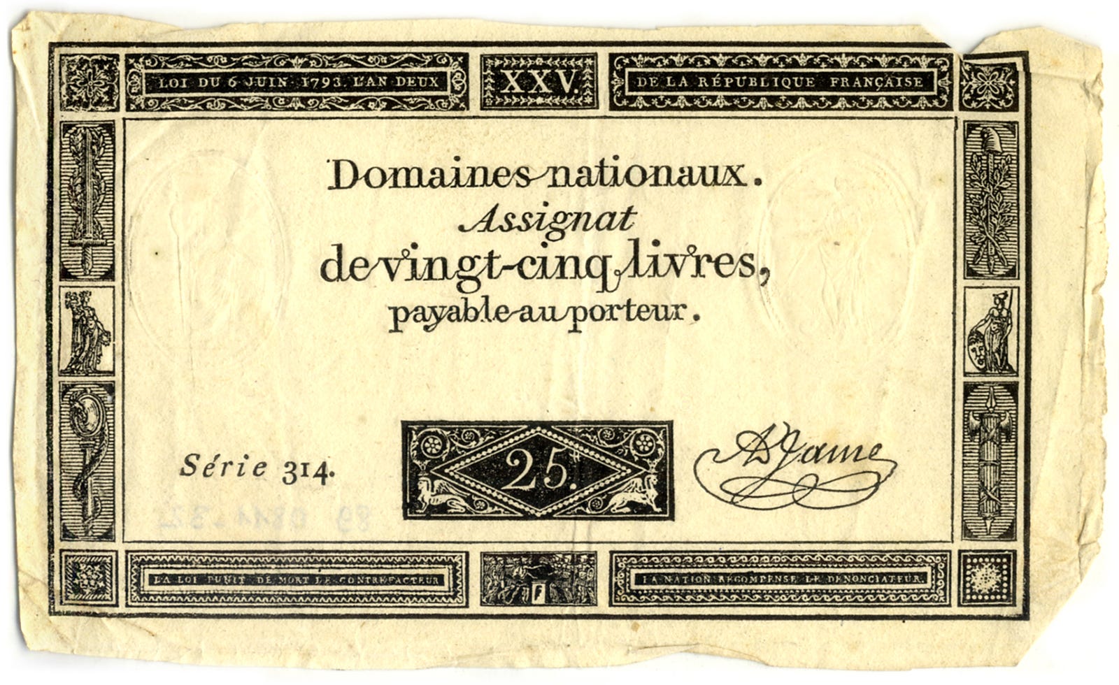
The Didot brothers were later joined by the printer Louis-Étienne Herhan, who has been perfecting the process of stereotyping, used for printing assignats. This was also a helpful way to combat counterfeiting, as it allowed specific modifications to be made to the foundry type during the engraving stage. The customizations include such visual quirks as inverted characters or misplaced accents—that were not errors but deliberate, secret markers of authenticity. These markers were so secret, in fact, that few vendors knew of their existence or checked for them. Even today, it’s not uncommon to find counterfeit assignats on platforms like eBay. See if you can you spot a fake assignat among the images below (hint: look for smooth rounded type and a diamond-shaped dot on the “i” for the authentic one)


Polina’s featured archive is The National Printing House in France website—like so many of our favorite archive sites here at Casual Archivist, she notes that while it has a horribly designed online presence, its collection of priceless type specimens and punches are worth suffering for.

Sources: Author’s scans from Musée de l'Histoire vivante
 | A guest post by
|
Such an incredible tidbit of design/political history!!