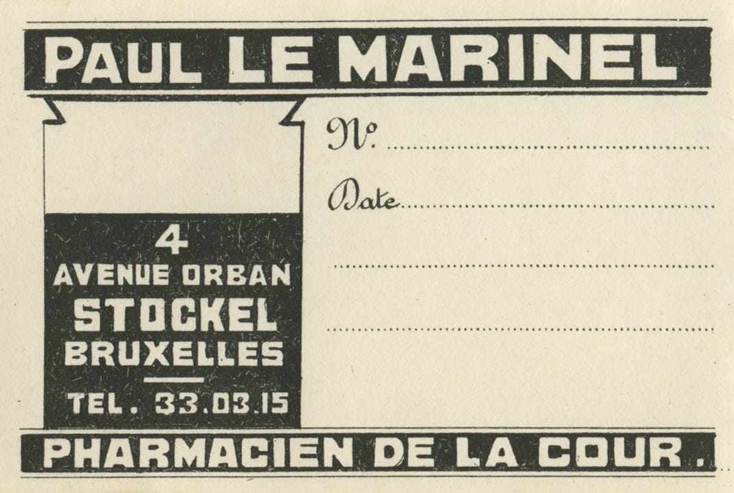
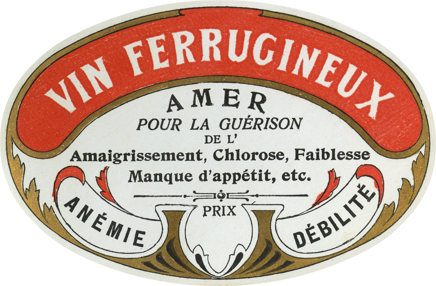
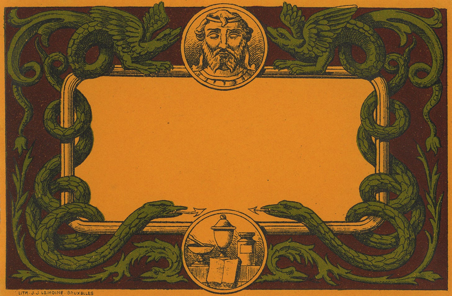
Today’s collection is a set of Belgian pharmaceutical labels. I found these at Brimfield Flea Market in Massachusetts, where three times a year I buy a myriad of old things I almost definitely don’t need (this summer's haul included a tramp art letter holder, a dozen copies of 1970s Oui, and a horny painting of Lincoln). There’s a dealer there who only sells dead-stock ephemera—he told me he bought all of it for just over $30k in the ’80s from a print shop that was going out of business—and I always like to stop isn’t by to see what he has. I typically gravitate towards broadly midcentury design (1920-1980), but in an attempt to branch out I ended up purchasing a big lot of these from him. I guessed they were turn of the century, and based on how similar they look to these German pharmacy labels from 1905, I feel vindicated in that guess (a fun side effect of looking at historic design for almost ten years now is a much improved nose for dating whatever I pick up.)
Most of what I have to say about these is identical to what I’ve said about ephemera in this newsletter before: “everything used to be more beautiful,” etc. But, to be specific, I like the way these designs in particular split the difference between ornamental and utilitarian; they’re not as gilded or illustrated as liquor and perfume labels from the same period, but they’re still far more decorative than the minimalist Swiss pharmaceutical packaging that is more often celebrated by graphic designers today. After catching both Covid and “walking pneumonia” this month (horrible), I can say with certainty that I would have much preferred these labels littering my bedside table over Nyquil and Mucinex.
This issue’s recommended archive is ARCBVA, an archive of Bulgarian visual art. I’m truly so stoked whenever I come across a regional archive and get to learn about the design history of a new (to me) place, and this is no exception. I see similarities to Russian and Greek poster design, of course, but also a bit of a nod to Polish design like that of (prior issue theme) Ty I Ja, too.
ICYMI: for my newest It’s Nice That column, I wrote about why mockups have become so ubiquitous and what it says about the design industry today—plus, a bit about our infatuation with scanning stuff, people who steal case study imagery, and why you should still always print your work out (really!!!)


Hi! Really like your newsletter (I was one of the many enthusiasts in the audience at the Birmingham Design Festival) but just wanted to let you know (for historical accuracy) that the labels (at least the ones with addresses on them) are Belgian, not French.
In Brazil, Granado, a 150 year old brand has a really great archive of many labels like these. It’s just stunning: https://youtu.be/EVgFCXed2H0?si=1bv8ti0fZXvUz_pf here is a process video of us going through it to design their 150 year celebration logo.