Today we have a guest issue from Rachel Cabitt, an artist and writer with a background in photography and design. Rachel and I met the same way I meet most people these days—online somewhere I don’t remember—but have since become IRL pals who try to get an ice cream cone whenever I’m in New York. She’s a true kindred archiving spirit, evidenced by her amazing newsletter, The Art of Cover Art, which researches the art history of music (two favorite issues to get you started would be this one about plagiarism and homage, and this one about the use of frames in album art). She’s also the co-founder of POND Creative, a visual studio for the music industry. I’m sure you’ll like her piece as much as I did!
About a year and a half ago, I purchased my first instructional vinyl box set at Academy Records on 18th St in Manhattan. Titled Night Moves: The Professional Approach to Disco Dance Instruction, the box set came with a 95 page booklet on various dance moves, from the “Airplane Walk” to the “Cuddle Turn,” with posed photos to reference. It was a product only the 70s could’ve produced.
Once I learned about the world of educational records, I of course fell down its vast rabbit hole. According to the BBC, the “production of instructional discs mushroomed, particularly in the United States, during the 1950s and 1960s.” From Ski Warmup and Conditioning Activities to Hear How To Tell Your Children the Facts of Life to Picking Up Girls Made Easy, the instructional vinyl was the modern form of the self help book and the early version of the internet search engine for life’s unanswered questions.
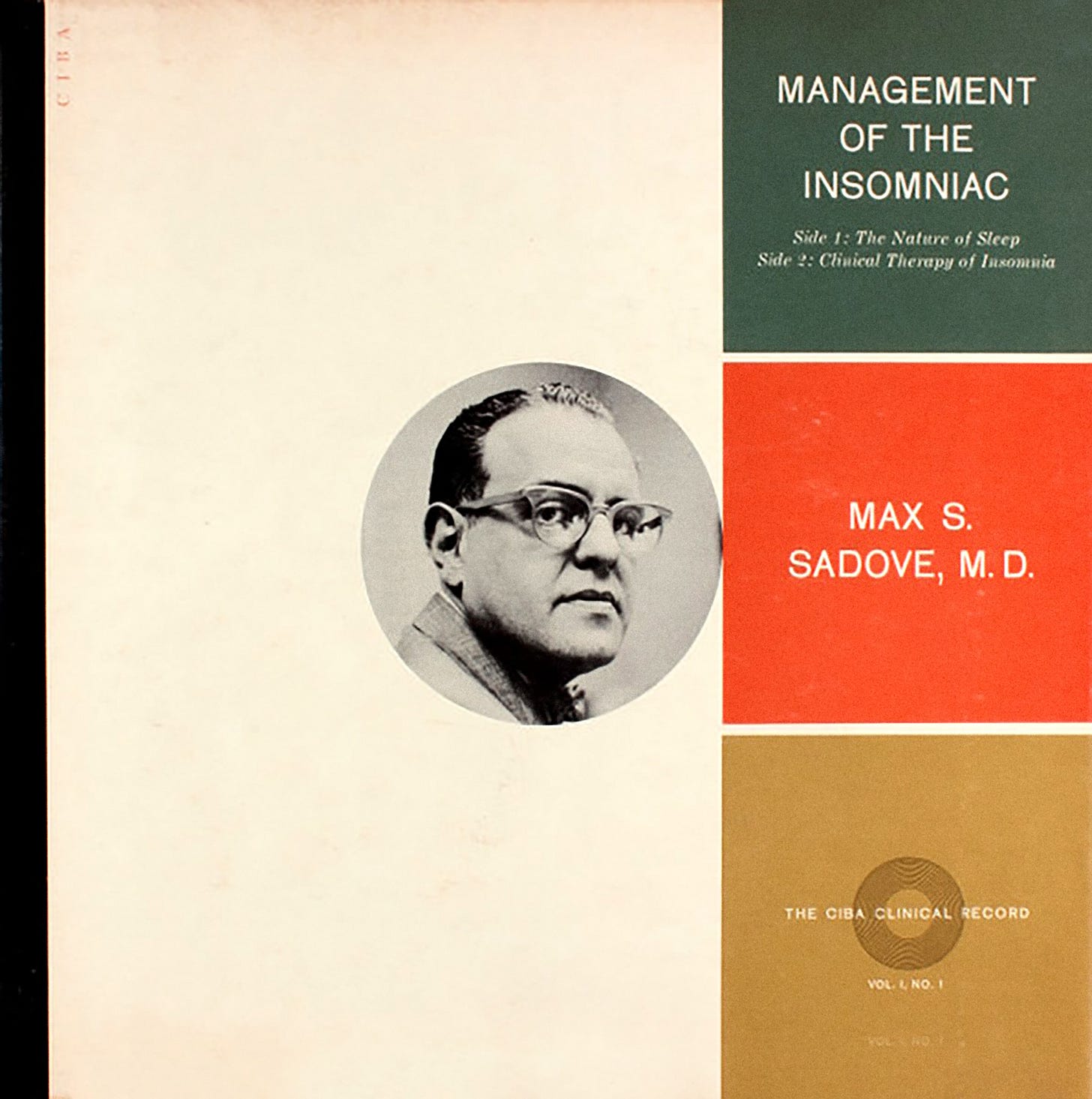
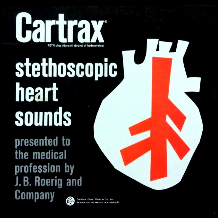
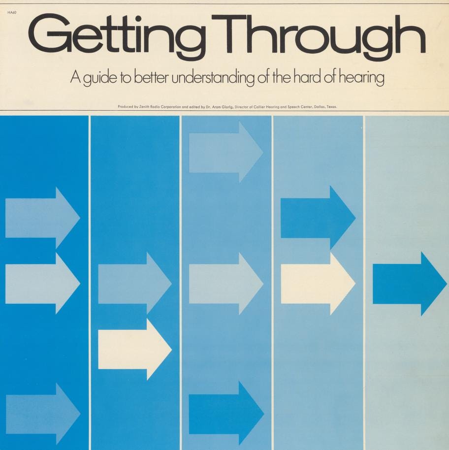
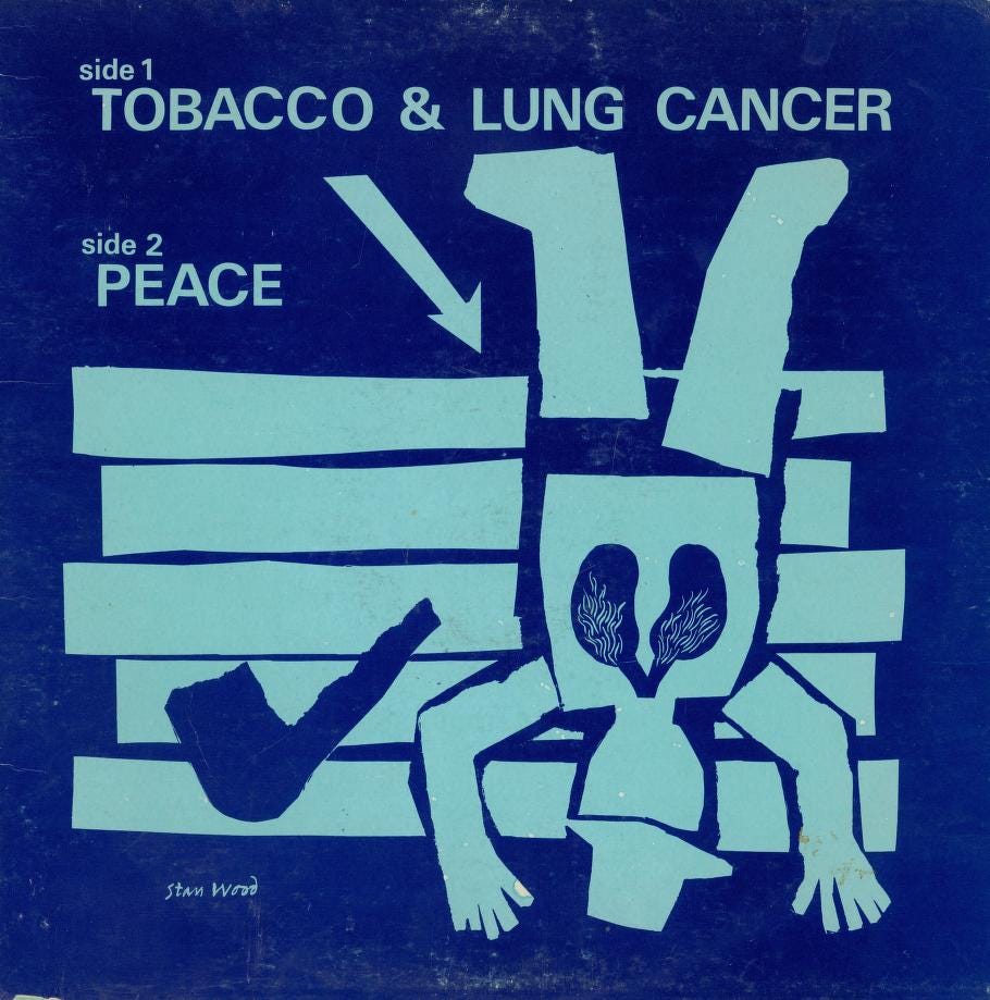
What has fascinated me most during my research has been the niche medical record. During the 1960s many major pharmaceutical companies, labs, and journals like Pfizer, The Excerpta Medica Foundation, and The Ciba Clinical Record sponsored and produced vinyl on various conditions from diabetes to congestive heart failure. While all serious information, the album covers all have a certain “mod” je ne sais quoi to them. Who knew that diseases could be presented so aesthetically?
While the visual artist names are rarely credited on these releases, what I enjoy most about them is that the designers were clearly given free artistic license to do whatever they pleased. The album covers elevate the banal subject matter with colorful abstract shapes and high contrasted photographs that successfully draw the viewer in. They’re reminiscent of Rudolph de Harak’s modernist covers for the classical music label Westminster, released during the same era. So… who wants to start a petition to rebrand the medical field?
This issues’s recommended archive is The British Newspaper Archive, which contains around three million newspaper pages, including most of the runs of newspapers published in the UK since 1800. It’s hard to summarize an archive like this because it really has a bit of everything—but I particularly enjoy some of the schlockier 1980s tabloids (like the one below, from 1988), if I had to pick.


The company I work for produces software that, among other things, facilitates the review of advertisements and promotional materials by medical, legal and regulatory committees at life sciences companies. Today, the cover art, the sticker on the vinyl, the audio—every part would have to be internally reviewed for the intended audience and then submitted to the FDA upon distribution. Lots of people collect old “gifts” like pharma branded pens, t-shirts, and office supplies that are not longer legal to give to docs, but I haven’t known anyone who collects old media forms that are no longer popular even if they would still theoretically be acceptable. Going to start asking my customers if they have fun archives with stuff like this at their offices!
this is extremely enjoyable thank you!!