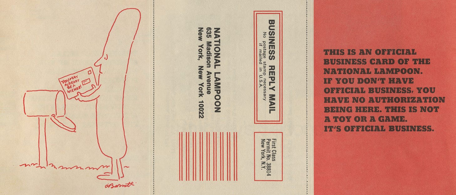
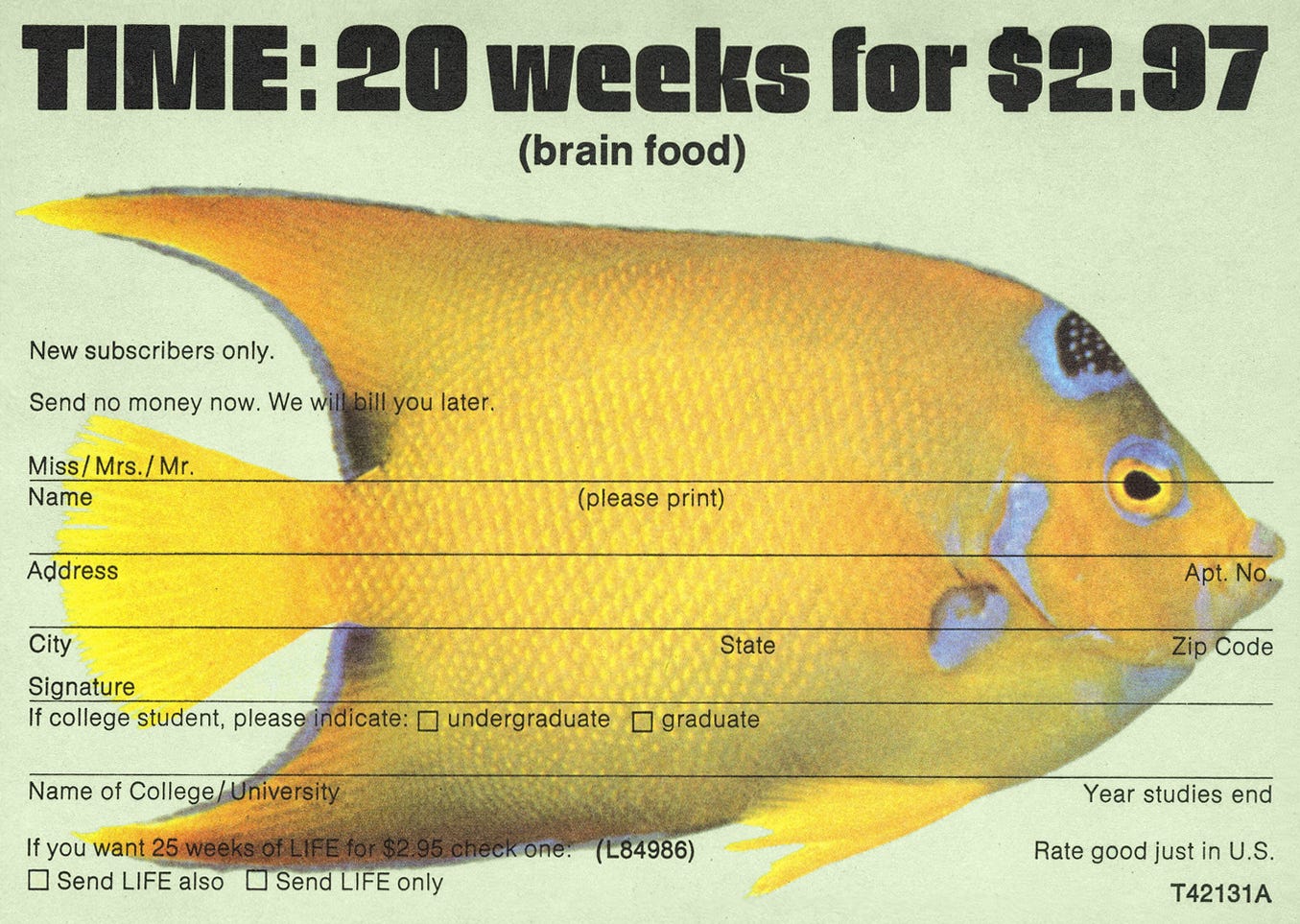
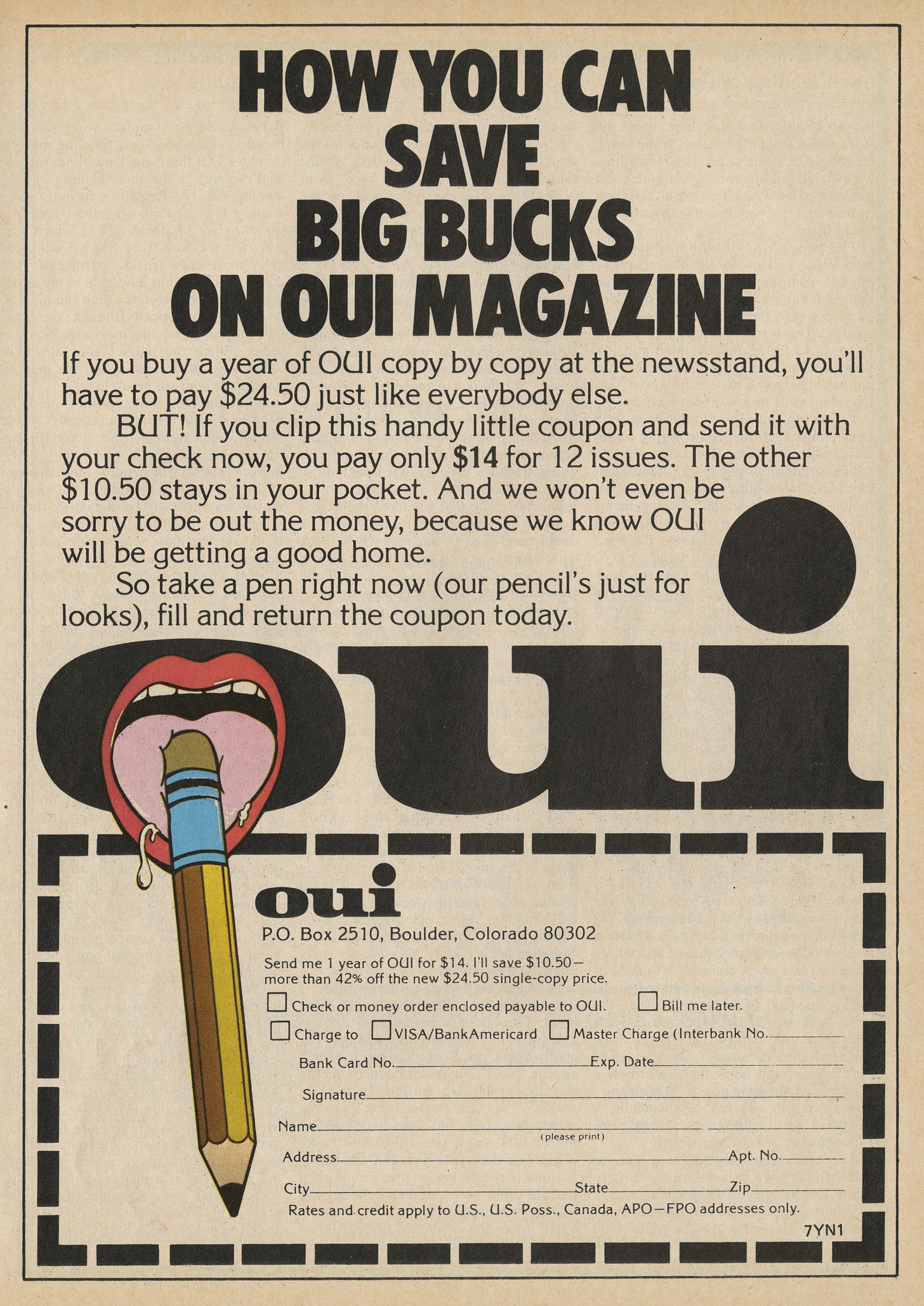
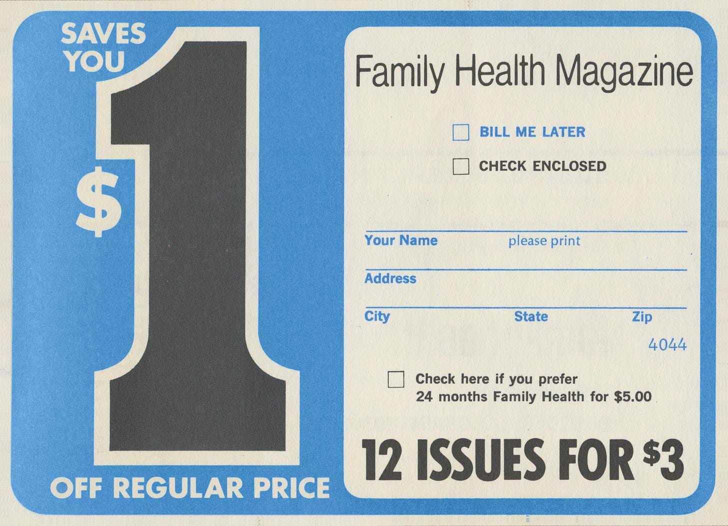
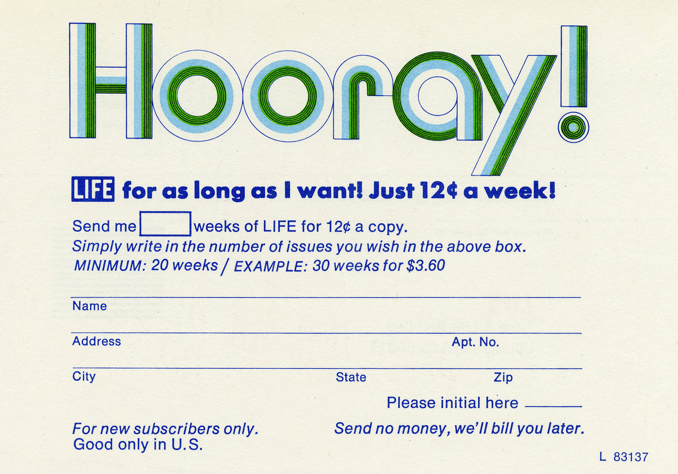
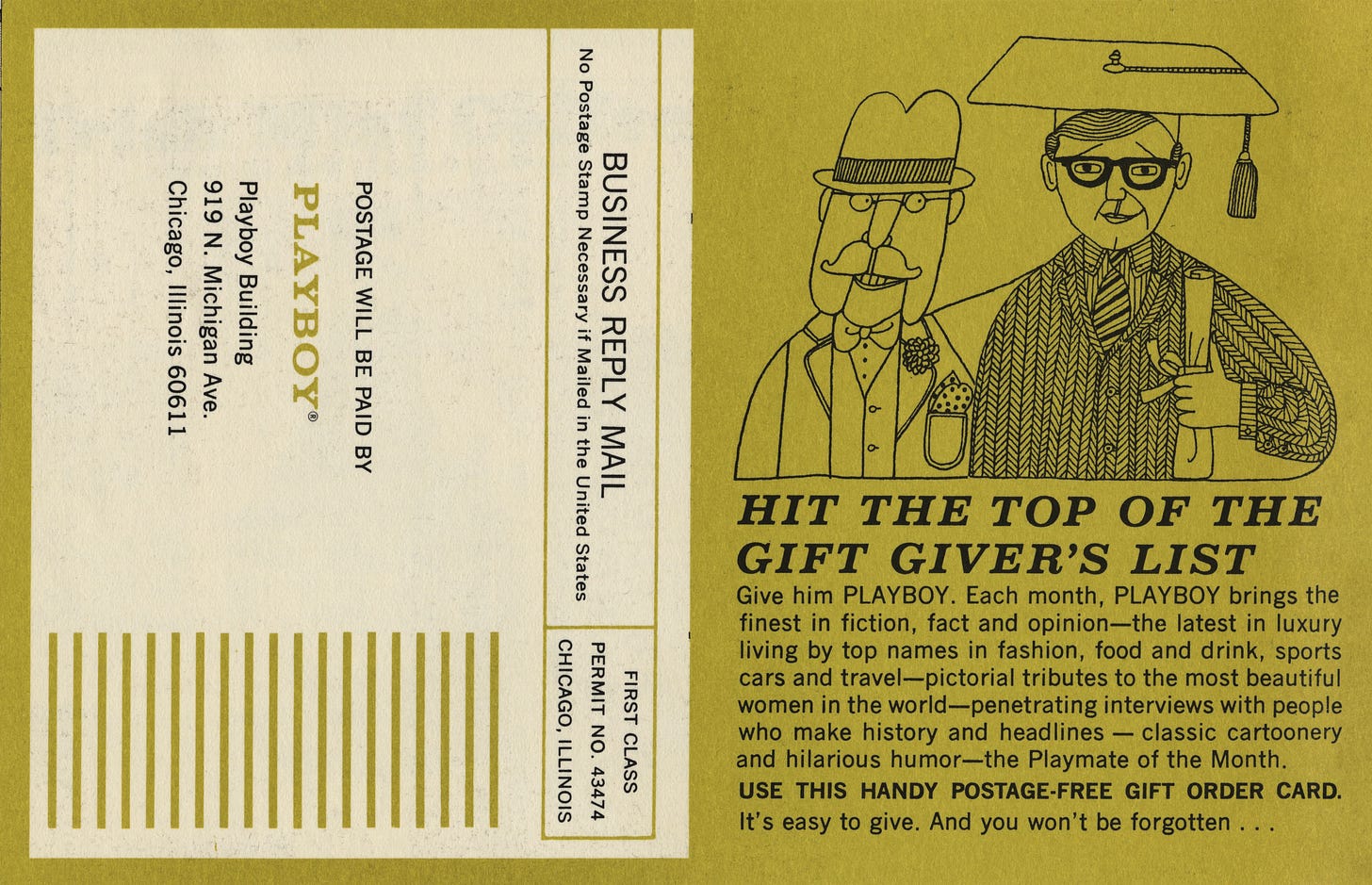
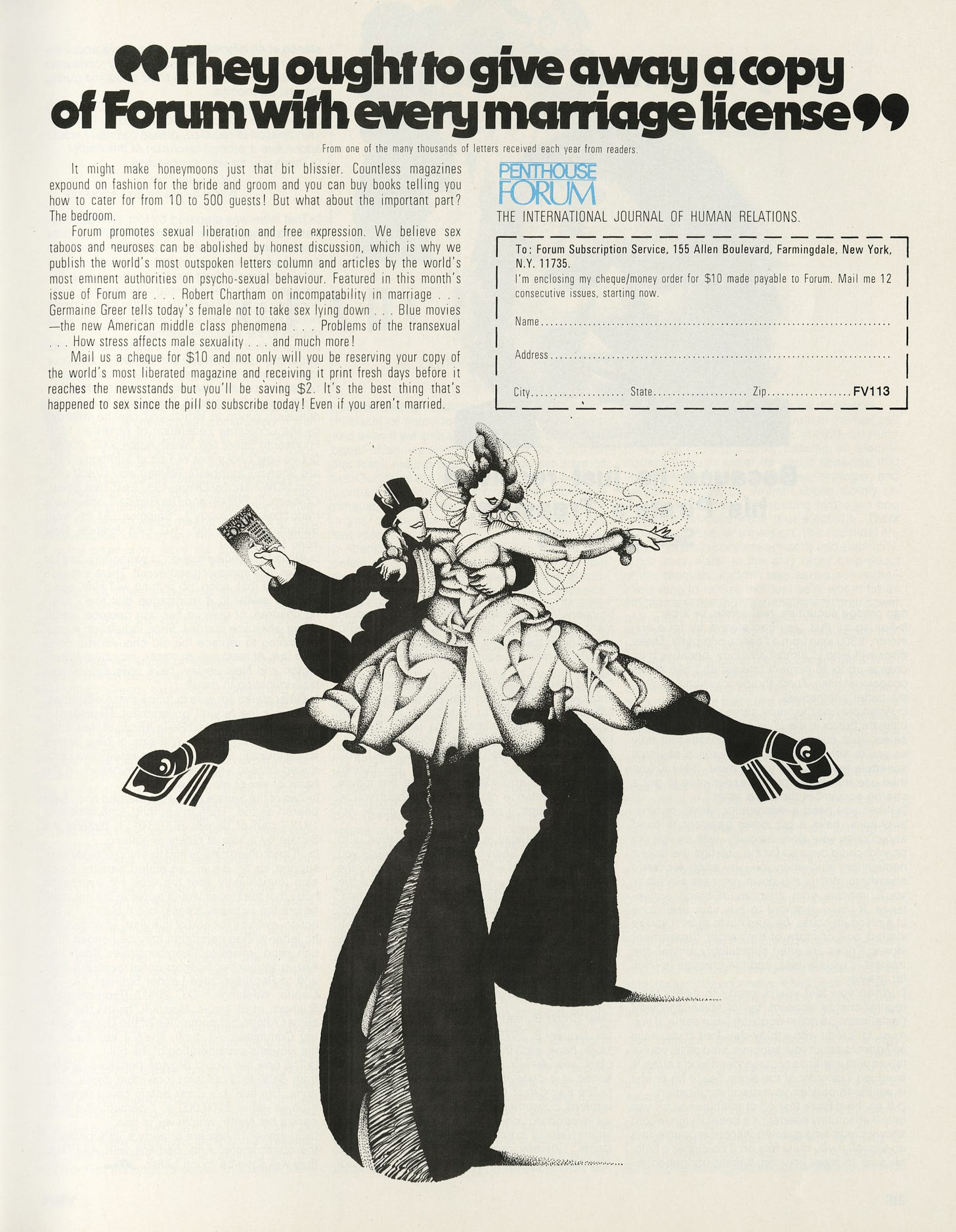
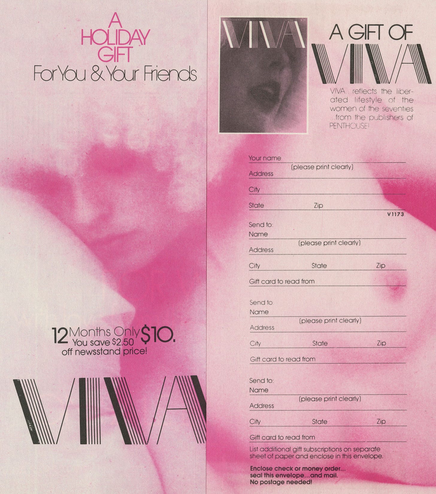
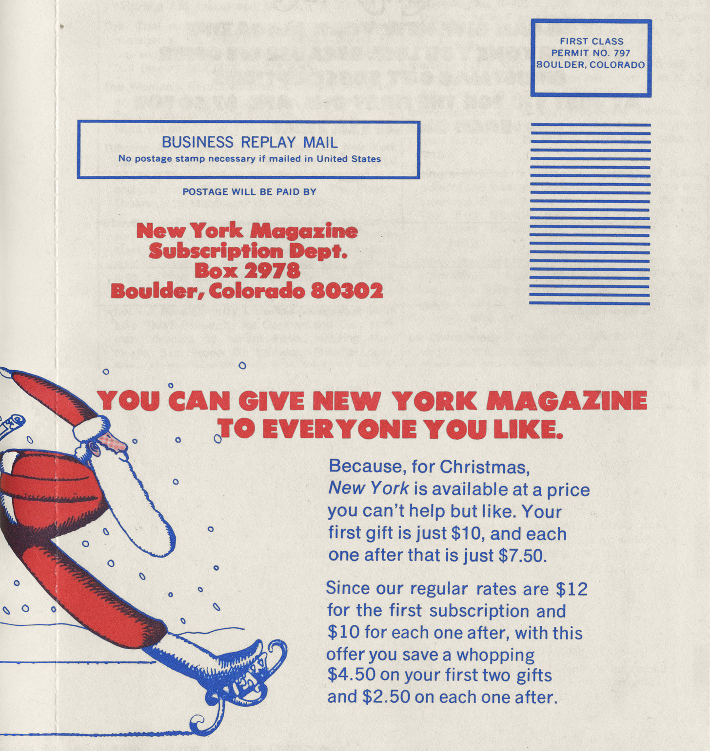
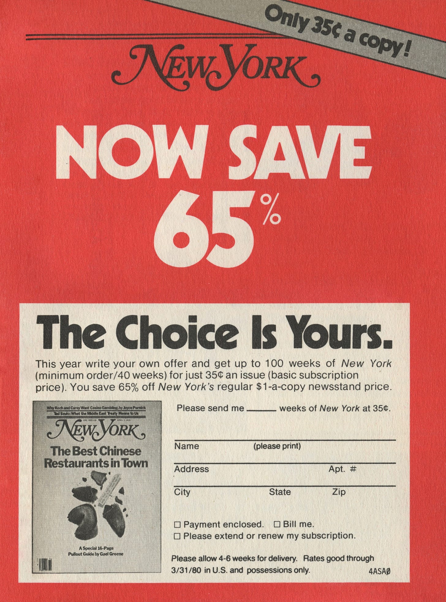
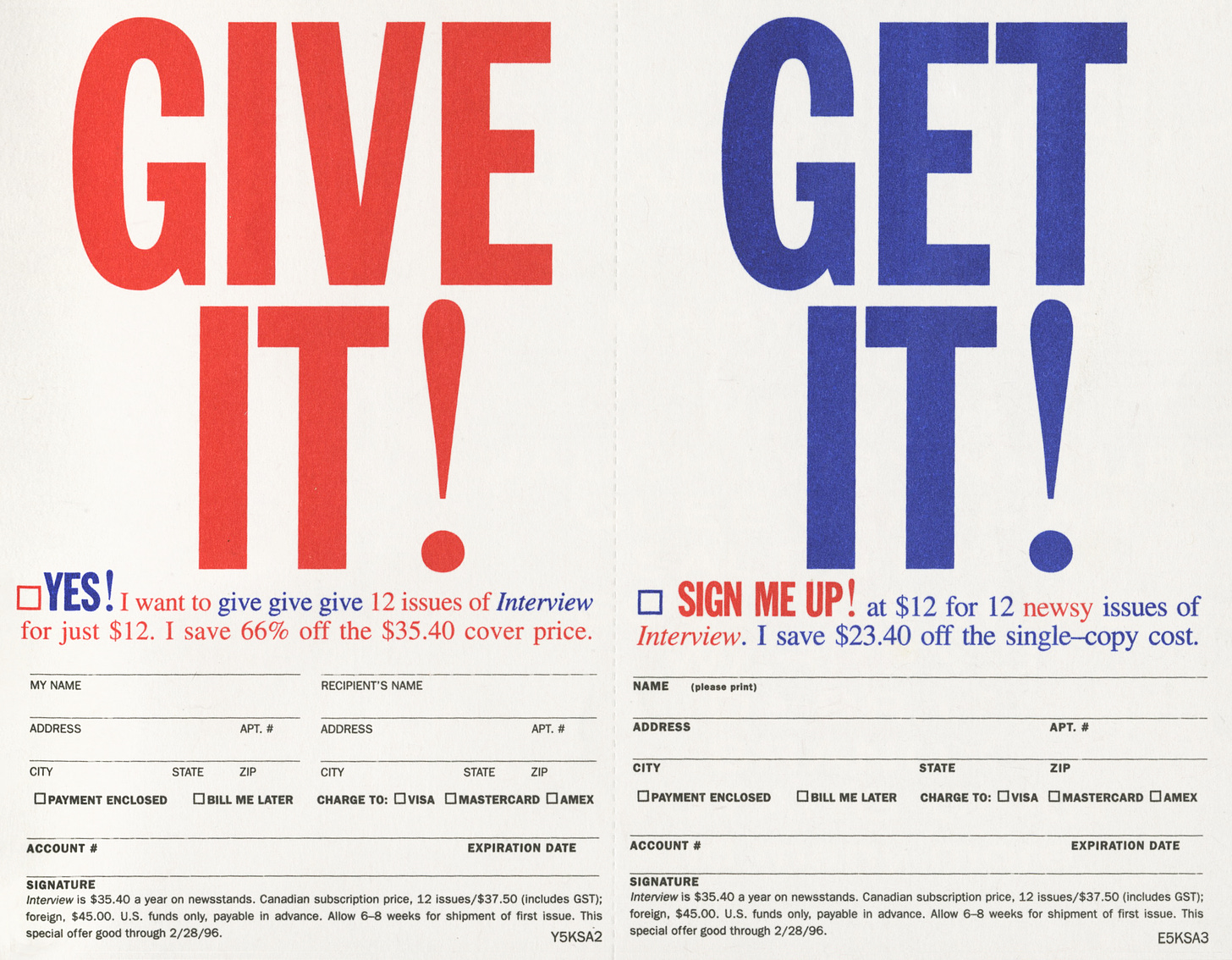
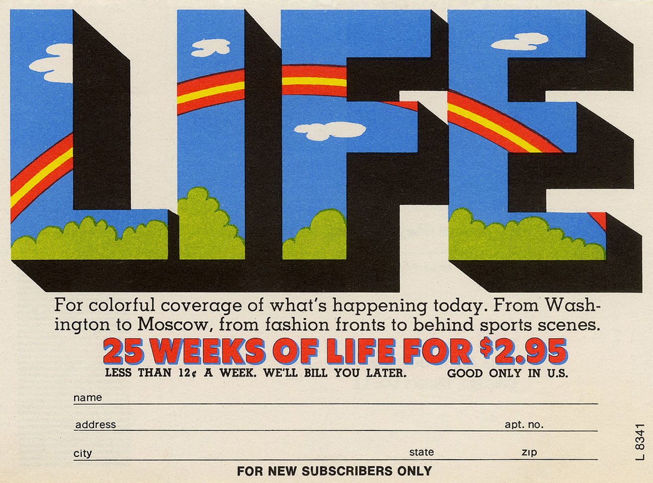
Today’s collection is a series of magazine subscription cards from the 70s, 80s, and 90s. I found most of them still stuck into the binding of the magazines in my ever-growing stack of old publications (though more often than not, I only saw evidence of cards that were ripped out—sent or discarded by a past owner). The cards are printed on shitty paper in just a few colors and usually feature an illustration accompanied by a pithy joke. They fall somewhere between advertisement, editorial layout, and bureaucratic form, which results in a satisfying mix of playfulness and utility—you wouldn’t think there would be this many ways to style a fill-in-the-blank!
In contrast to modern data inputting tools like Google Forms, which often prioritize function over form and can hardly be thought of as designed at all—just skinned—the cards are clearly the product of a reasonable amount of creativity and intention. As a collector and lover of old things, they make me think of all the surfaces that have been robbed of visual care in the transition from tactile to digital, and the 21st century quest for efficiency: maps, flyers, RSVP cards, and yes, even junk mail. In its most ephemeral form, print still demands a human touch.
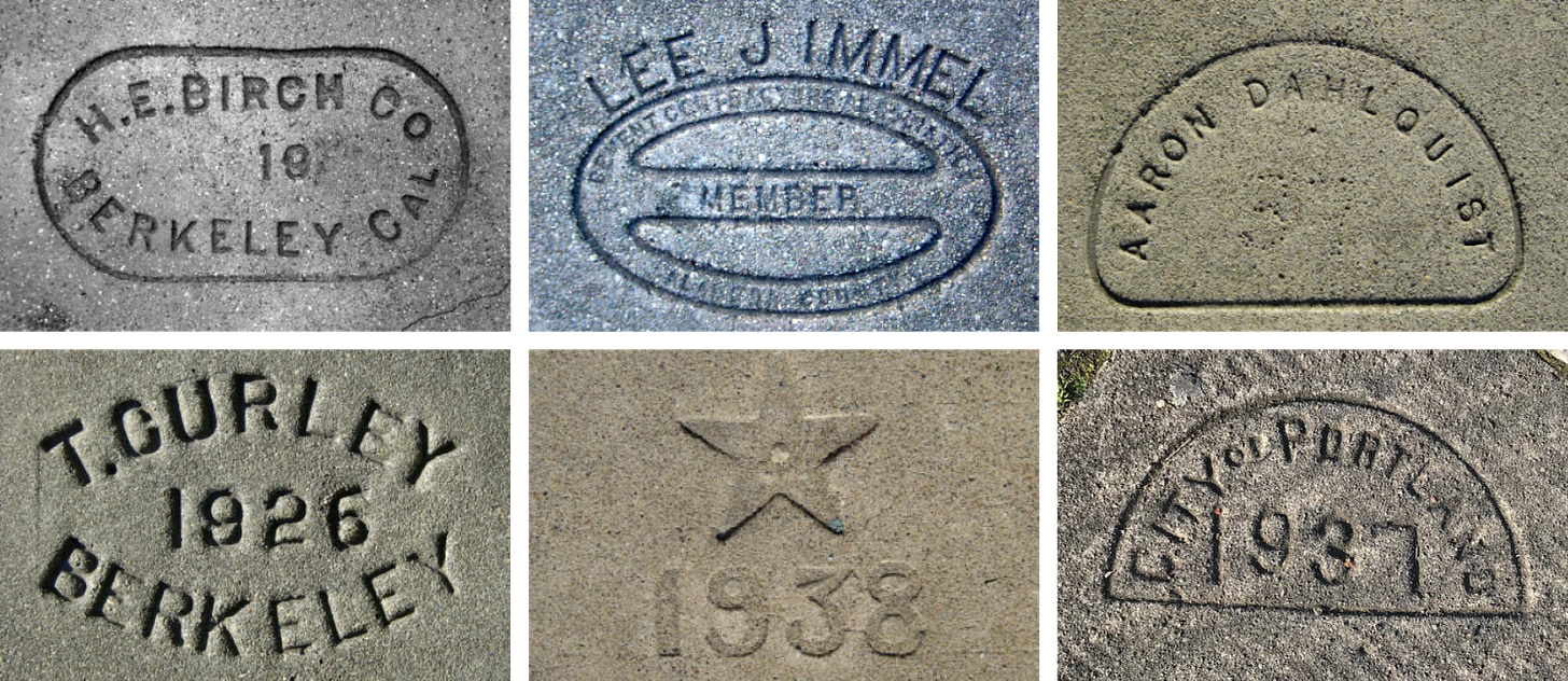
This issue’s recommended archive, Lincoln Cushing’s Sidewalk Stamps archive, follows in the same spirit of showcasing oft-overlooked pieces of design. Sidewalk stamps have fallen out of favor since their heyday in the early 1900s, primarily due to concerns over litigation and shifting attitudes toward craftsmanship. Although made of resilient materials, these marks are rapidly fading from the urban landscape, affected by curb cuts, repairs to buried utility lines, and widespread gentrification. I see a lot of these in Providence and they always make my day!




I almost forgot about magazine subscription cards. Loved this!
Amazing. my first day on the job as an assistant art director, the WOMAN I worked for told me that the subscription cards and coupons were as important as the ads and main artwork. From that day on everything was worthy of design. It was a mantra I passed on to my students of design and typography. Design is in the detail (as well as the idea).