Hi friends! You might notice that it looks a bit different around here…
Some context: shortly after I sent out the last issue, I took on a new role as the US Editor-at-Large for It’s Nice That, where I write about the design industry, visual trends, and whatever else is on my mind IRT the creative world (if you’d like to hear more from me on those topics, my monthly column is here). It’s been really fun! The only hitch—fitting this new part-time position in alongside my design practice did unfortunately eat into the small bit of newsletter-writing-time I had remaining. On top of that, I also crossed 6k subs a few months back (!) and had to jump up to the next Mailchimp subscription tier as a result, at $145 a month.
I started Casual Archivist to make design history more accessible to everyone, and it’s important to me that it remain as open-source as possible. That said, it did feel a bit ridiculous to pay nearly 2k a year to send this out so infrequently for free. So, TLDR, I’ve moved to Substack for now! I’m not turning on paid subs—I just want to avoid losing money—but maybe I’ll try my hand at some bonus content someday. Some perks of Substack: you can now check out the archive of past issues more easily, and you can also comment on posts. I’d love to hear what you think!
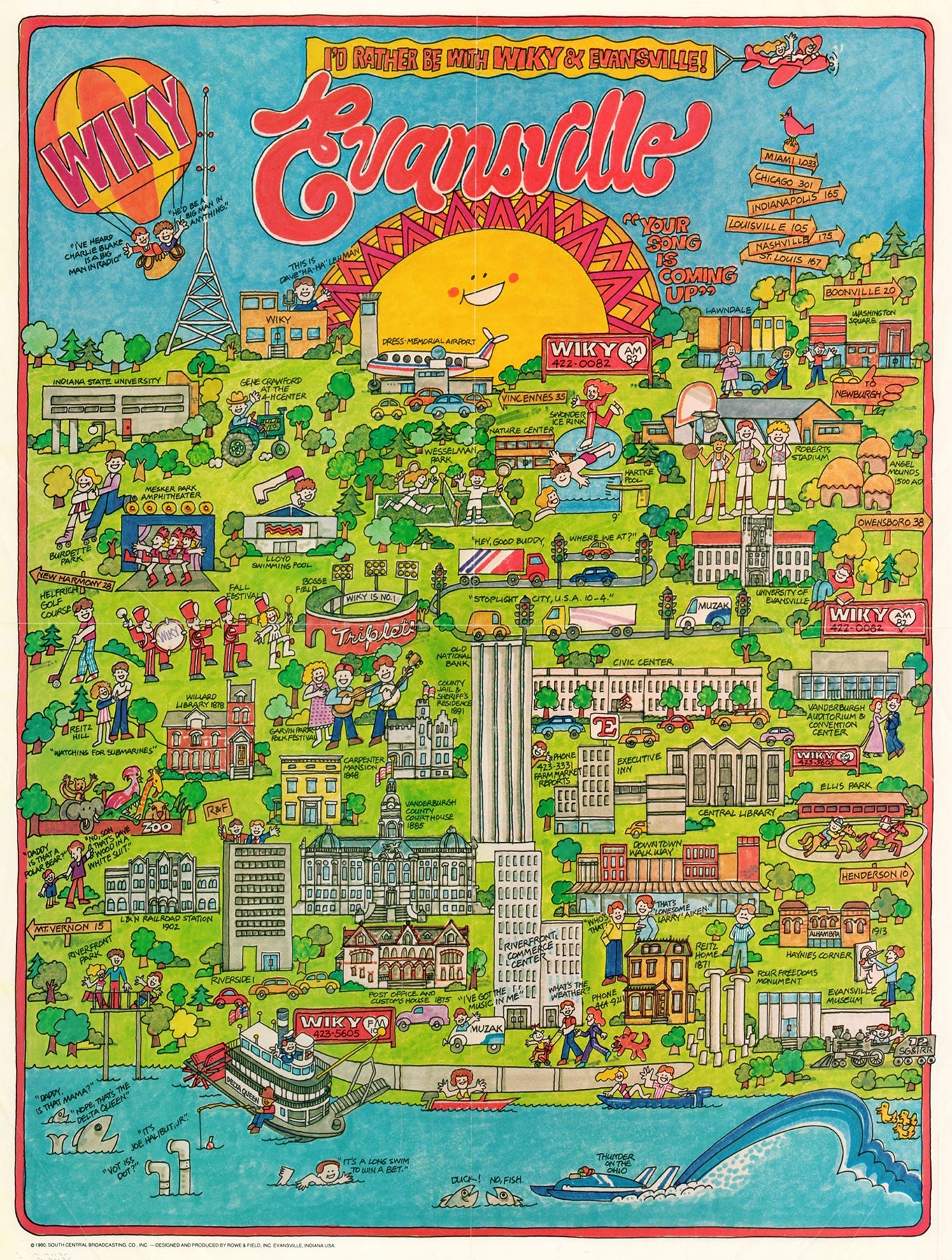
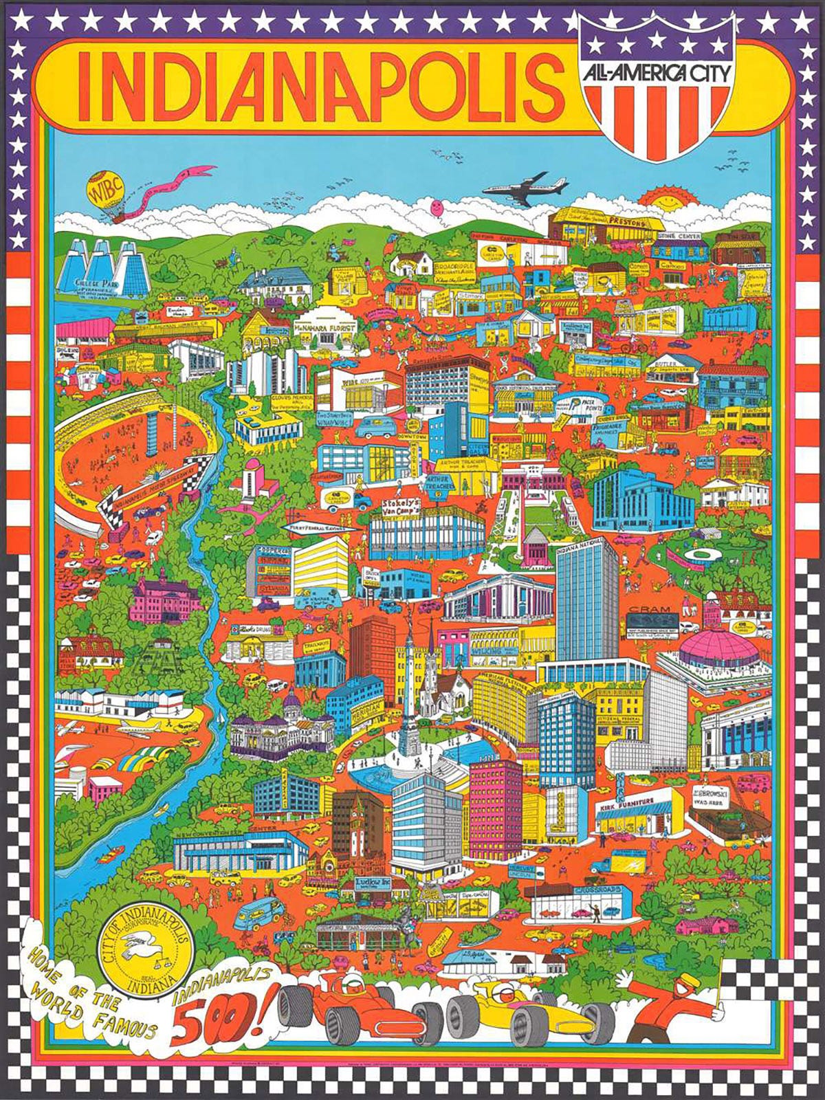
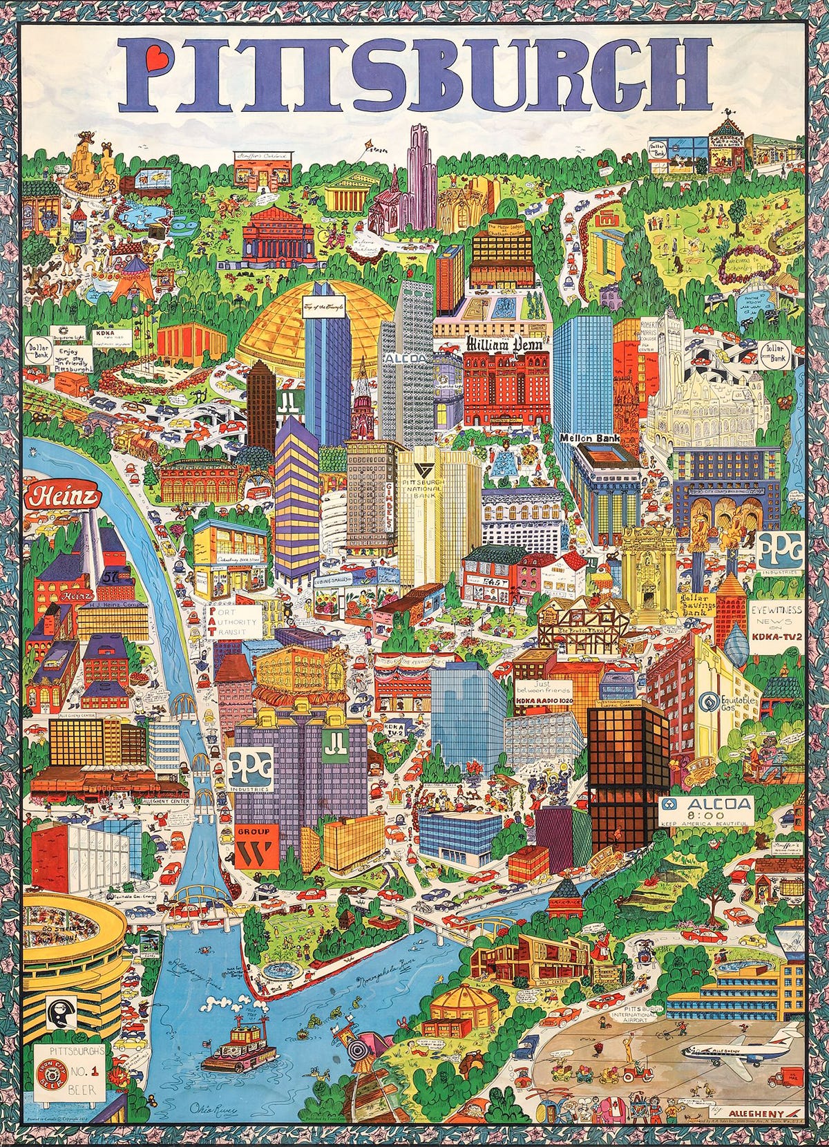
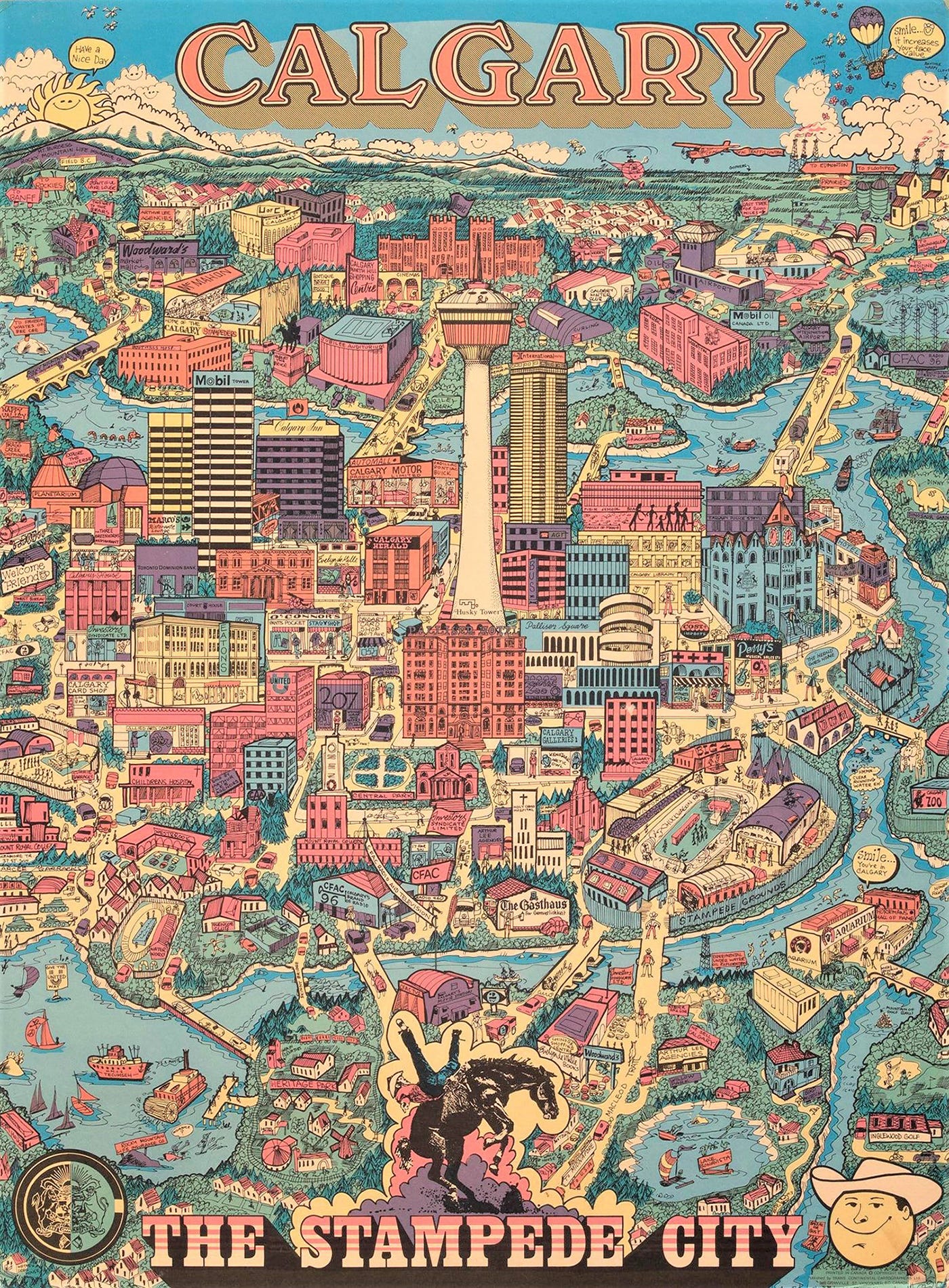
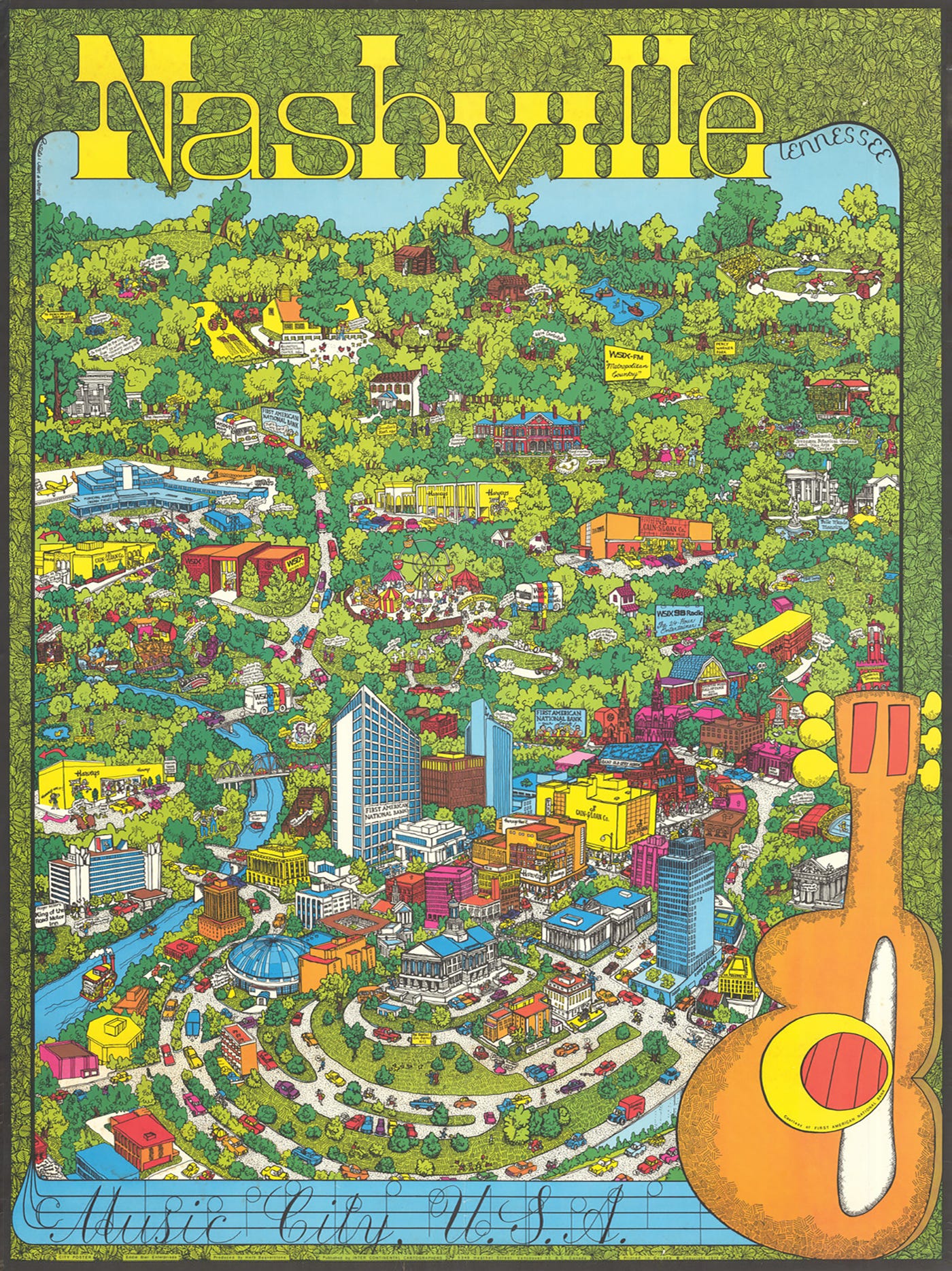
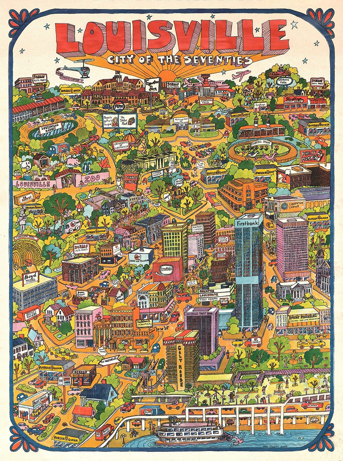
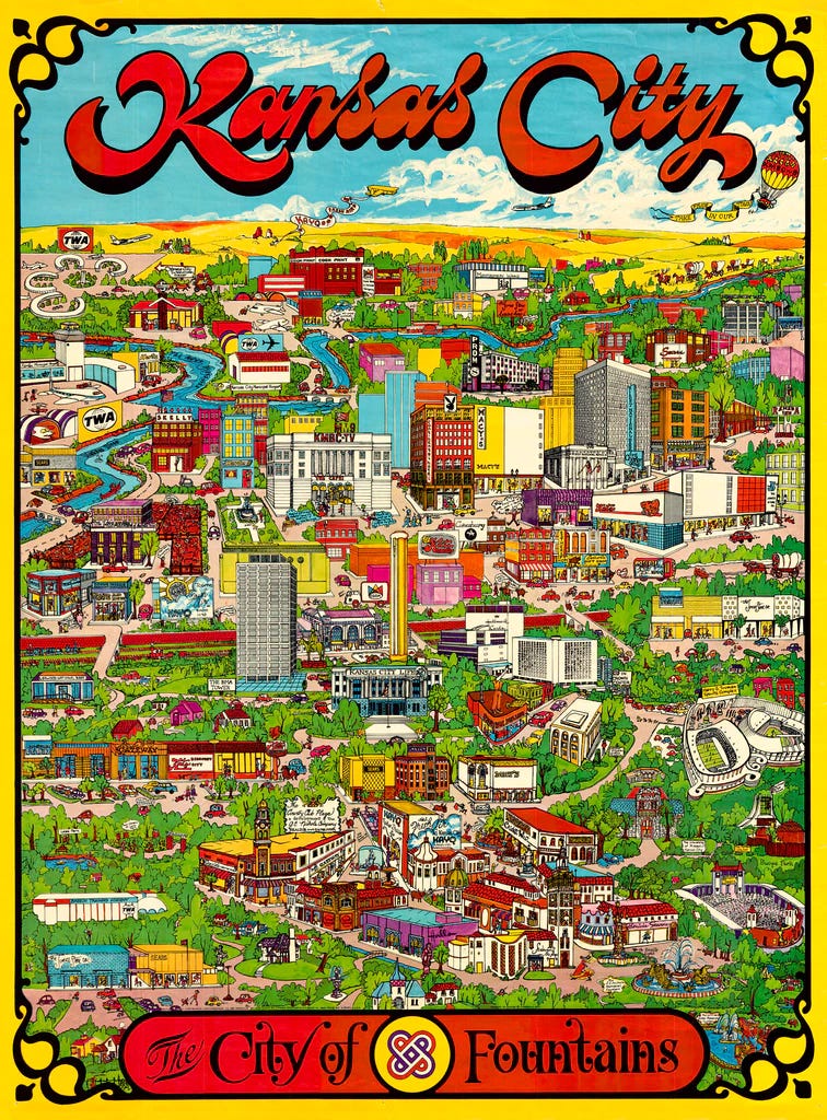
Today’s collection is a set of 1970s cartoon maps made by Canadian studios Inter Continental Cartographers, Archar Inc., and Trans Continental Cartographers. This style of whimsical, pictorial map emerged during the poster craze of the late 60s, and depict landmarks and scenes of daily life in a range of North American cities. The maps sacrificed accuracy for visual appeal, mostly serving as promotional tools (businesses paid for inclusion on the map) and collectible souvenirs. Trans Continental Cartographers alone produced over 30 city maps from 1969 to 1974, including maps for Ottawa, Aspen, Boston, and Philadelphia.
Besides the amazing typography and colors, I really love the strange, almost isometric approach to space that these maps use, which reminds me of the flattened perspective seen in Japanese Ukiyo-e landscapes. I just wish they made one for Providence!
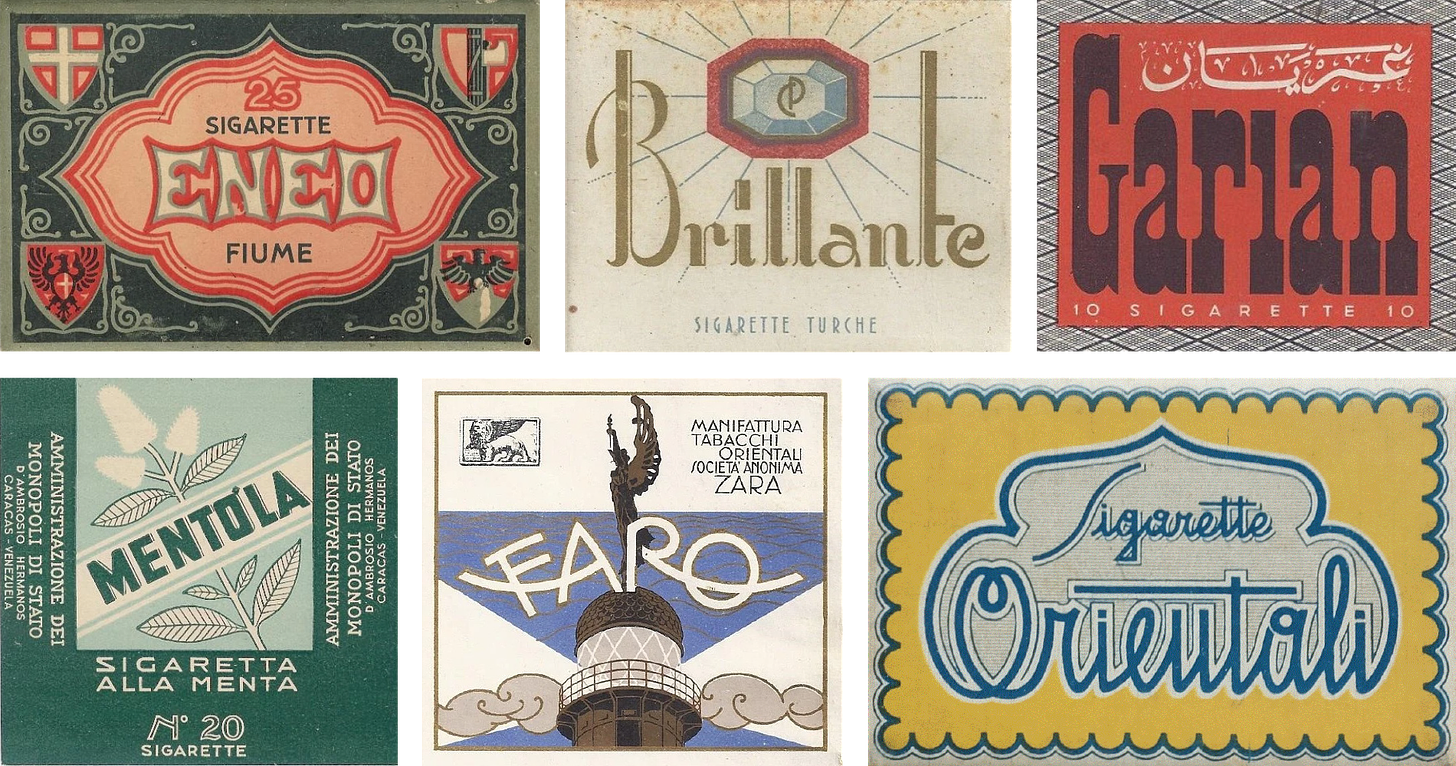
I just got back from two weeks in Northern Italy, so this issue’s featured archive is the Sigarette Italiane, a collection of cigarette packs produced in Italy and former Italian colonies.
I wrote a piece for Road & Track Magazine in March about car window iconography trickling down into design, fashion and beauty. I also chatted with Emilia Petrarca for her great article in Dwell about brand campaigns set in domestic spaces!






These are so great! I also wish there was one for Providence!
Wow I'm so glad I found this! I love your writing for It's Nice That and can't wait to get more great stuff in my inbox. Thanks for doing what you do!